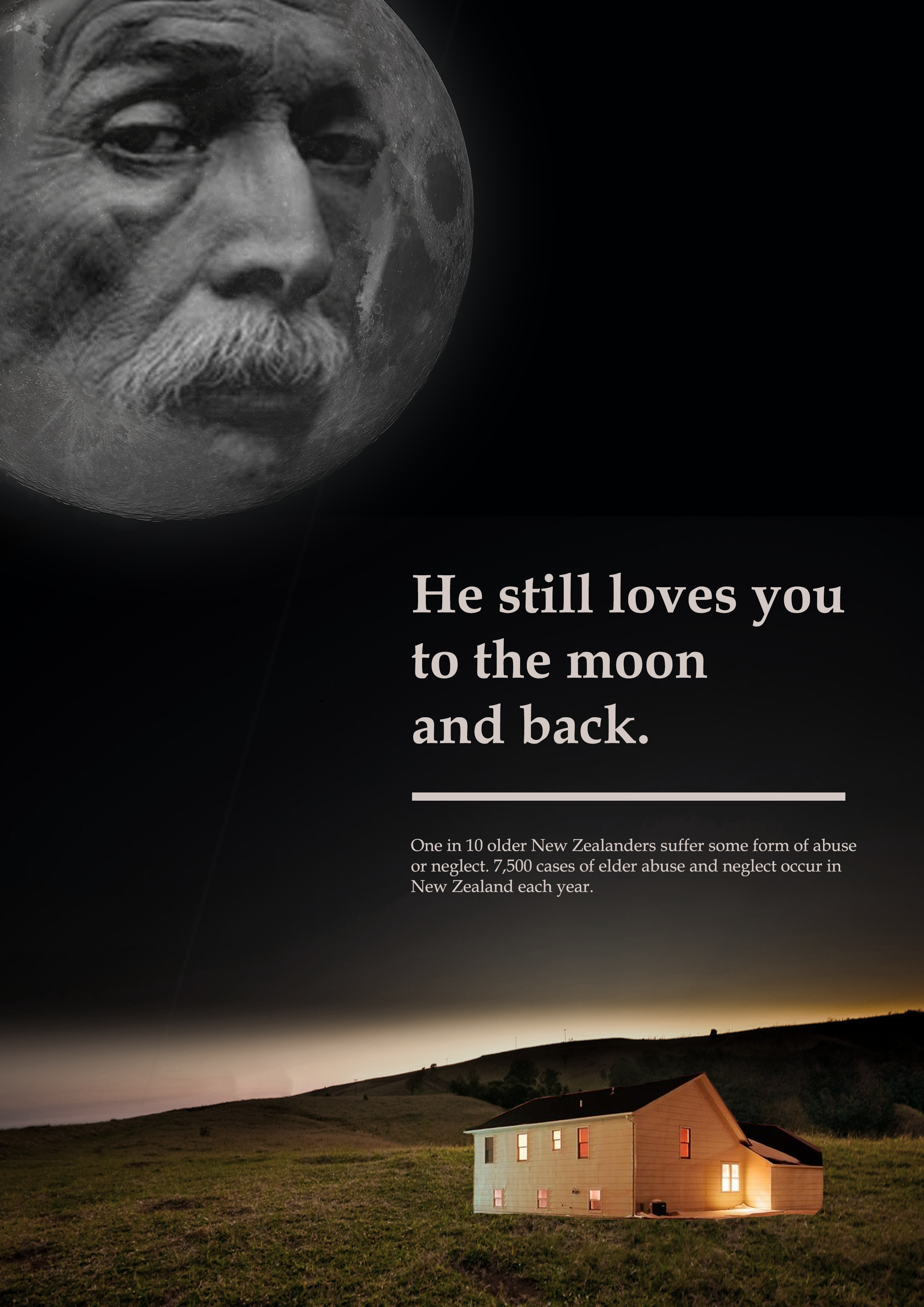
one in 10 older New Zealanders have suffered some form of abuse or neglect
an estimated 17,500 cases of elder abuse and neglect will occur in New Zealand each year.
This is today’s poster I made using statistics found in a news article online. Although this poster is visually appealing, I don’t think the meaning is immediately obvious – I was thinking it would be interpreted as the elderly person isolated on the moon, separated from warmth and family in the house down below. However this isn’t obvious, I need to work on making my imagery clearer.
A potential ‘different side’ to this topic could looking at the topic from the carers side of things – the fact that rest homes are facing staffing crisis, as record numbers of nurses are leaving care homes to work in the public sector in anticipation of better pay and conditions. Rest homes are struggling to find staff, and many are receiving warnings of closures.
Elder abuse can happen anywhere – private homes and care homes alike. The difficulty finding staff for care homes as well as the less than ideal pay and working conditions could mean that people unsuited for the job of carers are being hired purely because of the struggles to find staff – this could in turn mean that elderly people in these homes are being exposed to bad carers as a result.
Another side to this issue could be approaching it from a families point of view? Instead of the poster being from the elderly person’s point of view, designed to guilt people and make them feel bad, I could approach it from the families point of view, acknowledging how difficult it can be to try and take care of elderly people on your own, paying for treatment and care facilities and such whilst trying to deal with your own life, issues and family.
I could point them to solutions to these issues, such as organisations like the ‘MyCare’ app mentioned in the article above – which offers choices of police checked carers for hire, and also pays these carers higher than the minimum wage they would recieve working in a rest home – tying it in with the nursing issue I mentioned above.
Monday marks the beginning of the 10th annual Elder Abuse Awareness Week. It’s a shock to discover how little humanity some Kiwis have when it comes to the older generation.
We all need to keep an eye out for elder abuse. “Don’t let fear of meddling in someone else’s business stop you from voicing your concern. It is time to stop elder abuse in our communities,” says Scott.
According to Age Concern, three-quarters of alleged financial abusers in this country are family members who the older person has loved and cherished.
Groot has also seen older people go hungry because they can’t afford to pay for their groceries, and go cold because they can’t afford their power bill.
It’s also not uncommon, says Scott, for family to take over an elderly relative’s home, slowly squeezing him or her into a smaller part of the house. Eventually the older person is moved into residential care and the family take over the whole house.
A University of Auckland study concluded that we need community and societal change to reduce ageism. Practical strategies include the provision of information to older people, family and carers that support the empowerment of older people.
Dealing with the problem on a practical level can be difficult. Older people’s money is theirs to spend even if family don’t approve of what they’re doing, says Scott. And many older people will put up with the abuse because they don’t want the family torn apart.
There have been minor gains over the years. The Crimes Amendment Act has a legal requirement that a person who has care of a vulnerable adult has to protect them from being abused. Likewise the Protection of Personal and Property Rights Act has been strengthened requiring that enduring powers of attorney have independent witnesses.
Existing VCD Precedents on the topic:
I noticed when examining these existing VCD precedents that not many of them use the rhetorical devices we have been examining in class – namely satire / irony, parody and pastiche.
I think this could be for two reasons – one, it could be seen in poor taste as this is quite a sensitive issue, and two because this is an avenue that has not been explored by designers to a great degree yet – this is not a widely advertised topic, unfortunately. Most posters I have analysed have a focus on targeting the emotions of the viewer and making them feel sad, as opposed to attempting to use a clever device – I think it will be important for my posters to strike the right balance between being clever, and being tasteful.
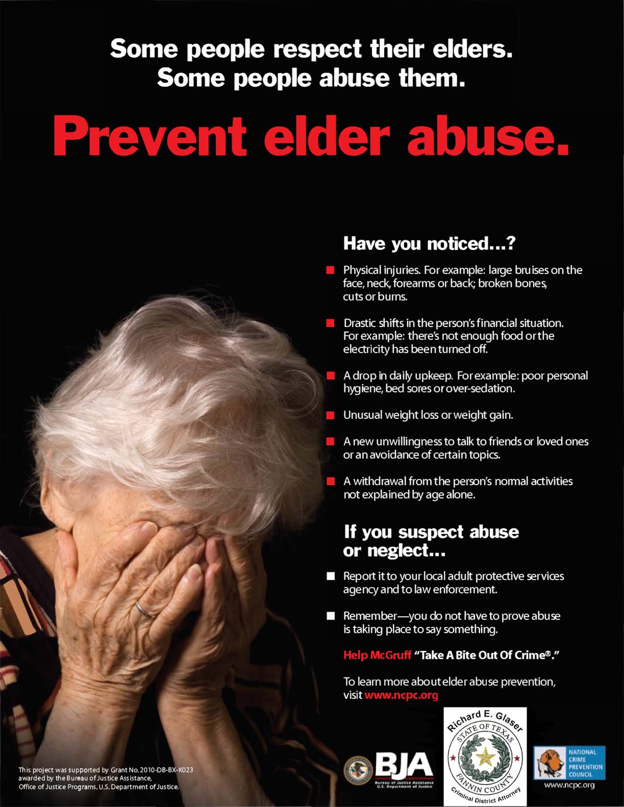
Scale – crying mans face is blown up, so that we can clearly make out the tear tracks down his cheeks and the pain in his eyes, making us feel sorry for him. http://www.elderabusehelpline.com.au/downloads/for-professionals/eahru-print-web-ads Contrast / Juxtaposition: Black and white image of younger woman placed over the top of the coloured, older womans facehttps://nyceac.org/elder-justice-dispatches-nyc-elder-abuse-campaign/ Contrast: Black and white with larger yellow text – yellow often a symbol of danger or caution Scale: Man is small enough that the black background envelops him on either side – symbol of his isolation / feeling alone and trapped in his pain.
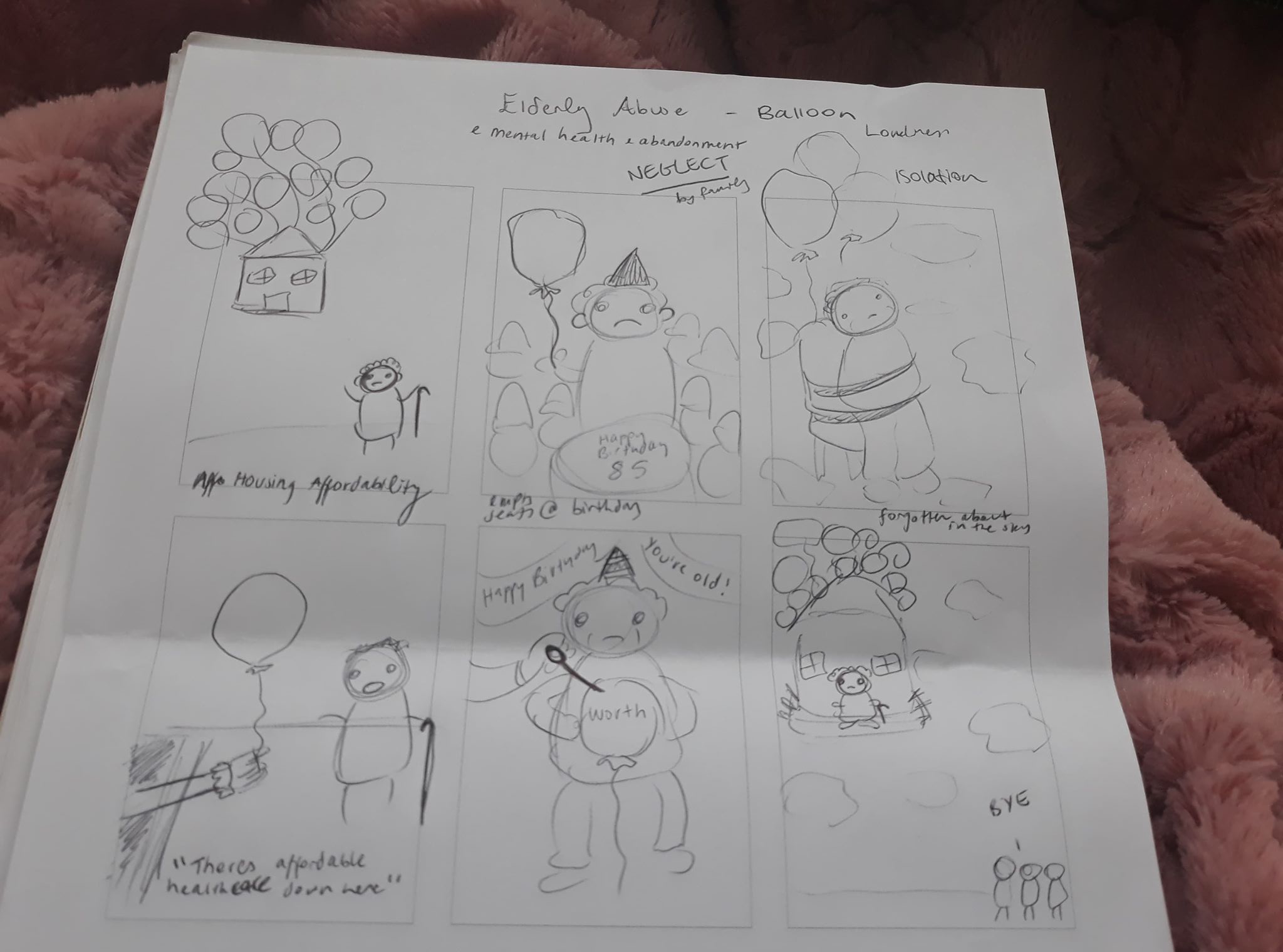
Today in class we did an exercise where we were given two words, and tasked with incorporating those words into several thumbnail sketches about a certain issue of inequality in New Zealand.
My inequality issue was elderly abuse, encompassing different aspects such as neglect by family, mental health issues and loneliness and isolation.
Balloon:
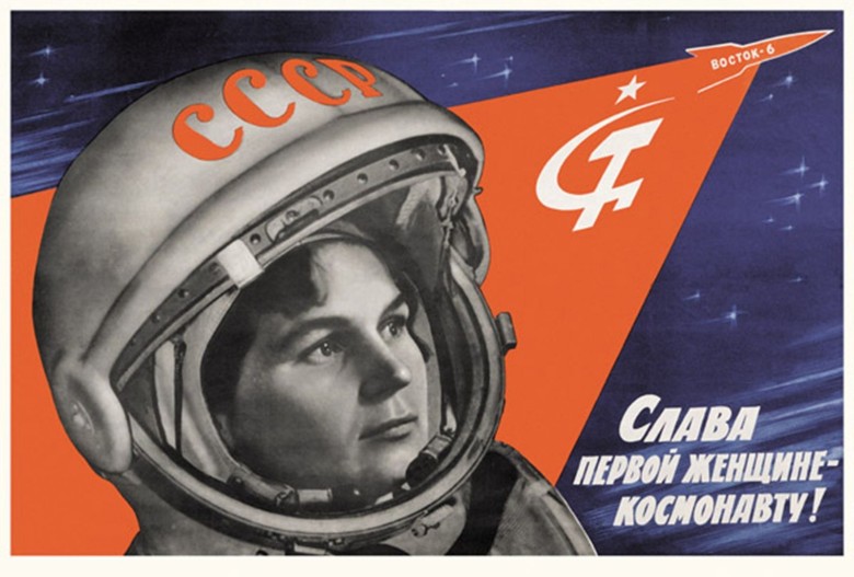
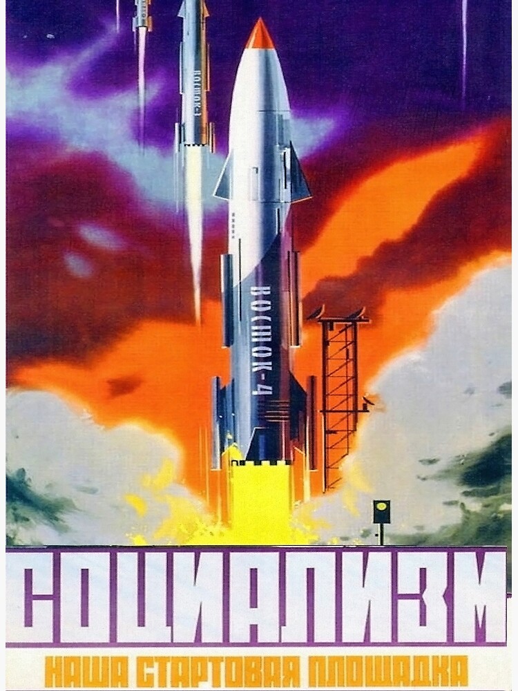
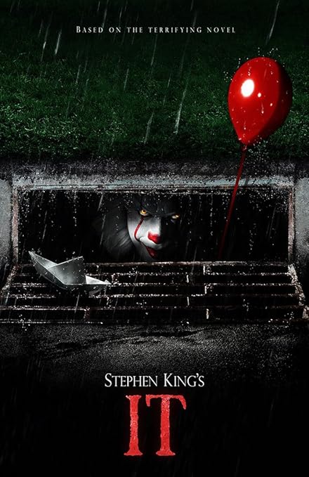
I explored ideas of balloons used at birthday parties with no attendees – showing neglect. I also used parody in the form of the house from the movie Up with all the balloons to make it fly – however the house flying away could be a metaphor for housing affordability, or the old person is standing on the house flying away as the family walk away, unbothered. I also explored parody in the form of an arm reaching out of a drain holding a balloon, with the caption “Doncha want affordable healthcare?” a reference to the movie It.
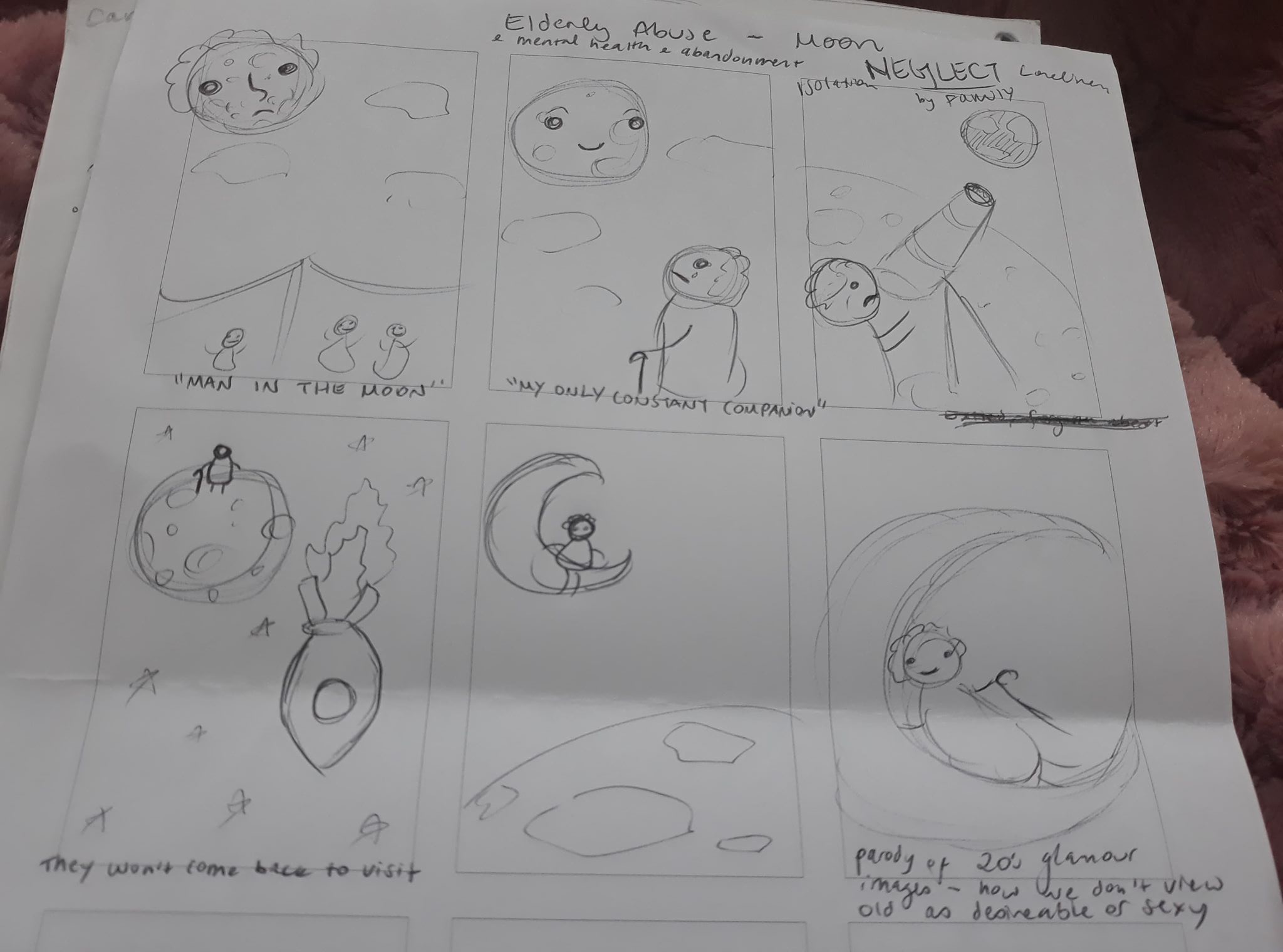
Moon:
The word moon offered some great ideas and visuals for loneliness and isolation – I thought of ‘the old man in the moon’ looking down at earth where everyone else is. My most poignant image is the one of the elderly person looking up at the moon with the caption “My Only Constant Companion”.
Poster:
I chose to make the image of the old person looking at the moon as my poster this week. However, due to time constraints as I had work very soon after class, this poster had to be made in a rush and is nowhere near as good as it could have been had I had more time.
However, I think it is still a very poignant image and an idea I can certainly build on. I played with scale, making the old woman smaller and the moon larger, to make the elderly woman appear dwarfed, very small and alone in the huge black void of the night sky – isolated.
The caption is “At least you’re still here” – the idea that the moon has been with her for her entire life, always in the night sky – no matter how many of her companions pass away or forget her, the moon will always be there. I think it is an effective, heartbreaking image.
Rhetorical Devices and Visual Solutions:
Parody:
Potentially a parody of space propaganda? Images of old people being forced into spaceships / strapped on, with captions like “Be free of your burdens!” “Send em off to space!”
Images of clown with a balloon and captions about “Affordable healthcare / housing” etc being down in the drain, with images of the elderly people eagerly climbing down / reaching for the balloon.
Parody of Up – houses flying away with balloon, unaffordable housing for elderly people, or perhaps a hospital or medical centre flying away for unnaffordable healthcare? Or elderly person themselves flying away on the house whilst their family are blissfully unaware of their loneliness and isolation.
Wehi – My response to this image was a humorous one, as well as one of exasperation. The ad is cheesy and funny – I appreciate the shock value of the middle finger. However the ad draws on the overused and problematic stereotype of the demanding bitchy girlfriend that is so prevalent in heterosexual culture – this bothered me.
Ihi – This work derives its power from shock value – seeing a huge middle finger on a billboard is bound to evoke a strong reaction from a lot of people. The sentiment the ad is trying to evoke is bound to strike a chord with its target audience also – this audience being ‘straight men with demanding girlfriends who are pressuring them into marriage’. The familiar and terrifying sight of an angry girlfriend staring you dead in the eyes with a disappointed face, flipping you off, is bound to get a knowing chuckle from this target audience.
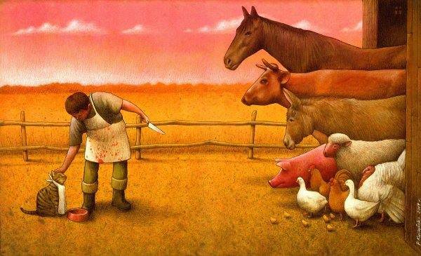
Wehi – My response to this image is one of shock, sadness, and disgust. Having recently written an essay about Western society’s disconnect from the natural world, and the way we see ourselves as having dominion over animals as opposed to co-existing equally – I found this image to be a particularly relevant and provocative commentary on the current state of our world. A world where we disgusting, depraved, cruel humans reign supreme, and see ourselves as having the right to decide the worth of another beings life.
Ihi – The power in this image lies in the subtle details. At first glance, this appears as if it could be an image from a childrens book – soft colours, sweet animals. However when one looks closer, only then can they discover how dark and twisted this ‘friendly looking’ image really is – you see the knife pointed towards the herd of farmyard animals, the caressing hand outstretched towards the pampered cat, the blood splattered apron and the ominous red sky. This images power lies in its initial deception.
Wehi – My first reponse to this image was confusion, followed by an unenthused “Oh” when I figured out what it is meant to be. A woman with sticking plasters on either side of her mouth because Burger King has ‘REAL BIG BURGERS’ and I guess they hurt her mouth as a result? Is this supposed to be an attempt at connecting to customers through humour? It certainly didn’t work with me, the image is not aesthetically pleasing and is unpleasant to look at. Why do the sticking plasters have dots? Is it because without them, the image would be even MORE hideously bland and beige and flat ?? Burger King is a cheap fast food brand – fast being the operative word. This attempt at a joke is clunky and not immediately obvious – if humour is attempted in fast food ads it should be quick, snappy, attention grabbing and obvious.
Ihi – I included this image because I wanted to try and analyse an image that I didn’t think worked well / held much power. I can see what they are trying to do / say, that they are trying to be inventive and clever, trying to be powerful in the fact that they are straying away from the typical uninspired shots of burgers and fries that are typically on fast food adverts. I just don’t think the joke is particularly clever or successful, it isn’t punchy enough to work – I can imagine this idea being pitched in some meeting or the other, but can’t imagine how it got this far. It isn’t a good image.
Article about how Muslim responses and voices were not only heard but prioritised by mainstream media for several weeks after the Christchurch mosque attacks – and then subsequently muted again as a debate over free speech took over. This debate “has overshadowed the need for medium and long term reforms that focus on whose voices are prioritised.”
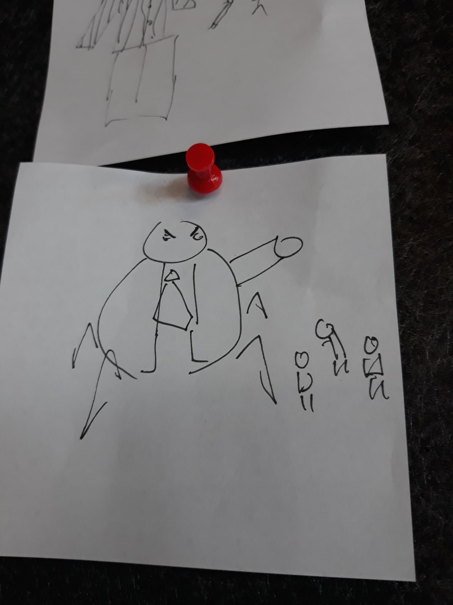
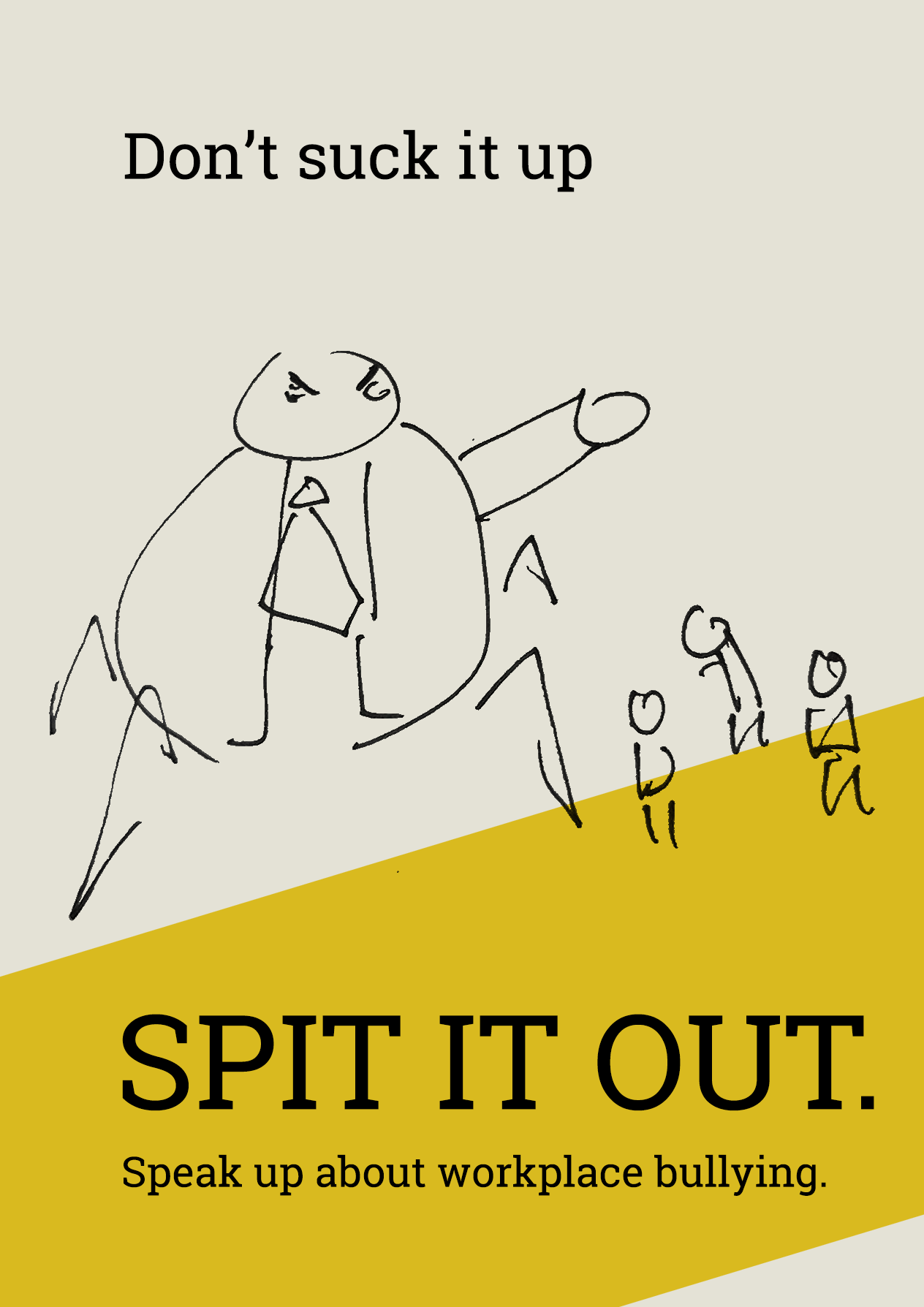
Today in class we were given a task which involved drawing images quickly – we then had to select one of these images to make into a quick poster for our homework.
I chose an image that somebody had drawn for the word ‘Boss’ – a scribbly drawing of a large angry man wearing a tie. He seems to almost have spiderlike legs, making him into a monstrous caricature of a stereotypical nasty boss in an office. Several tiny people are scurrying around at his feet.
I then created a quick poster using this image. I decided to try and make the image fit with a prevalent form of inequality in New Zealand – workplace bullying.
I cam up with the slogan ‘Don’t suck it up – SPIT IT OUT’ whilst reading this article about workplace bullying in New Zealand:
as the article mentions how in New Zealand we view workplace bullying the same way domestic violence was viewed 30 years ago – we have this ‘suck it up’ mentality wired into us as Kiwi’s, so we don’t always feel comfortable talking about things like this, which is a problem.
I made the background an off white almost grey so that the yellow stripe would stand out against it. The stripe is tilted to add interest, and provides a slope so that although the Bully Boss towers over his small employees, they are standing on the highest part of the slope – they have the higher ground, they are on the right path, the golden road of salvation because they are going to come forward and speak about the bullying they are subject to.
I think the idea of workplace bullying could be a good idea to choose for my final posters, and I think the slogan I have come up with works well, although it could use some tweaking. However I would definitely change the visuals I am using, as they aren’t immediately recognisable as workplace bullying. The slogan doesn’t give too many clues either, so the image I would use might need to be a bit more obvious.