My central concepts for creating these posters are the issues
of loneliness and social isolation that are prevalent amongst older New
Zealanders. Within my two posters I used rhetorical devices in an attempt to
influence viewer responses to my work.
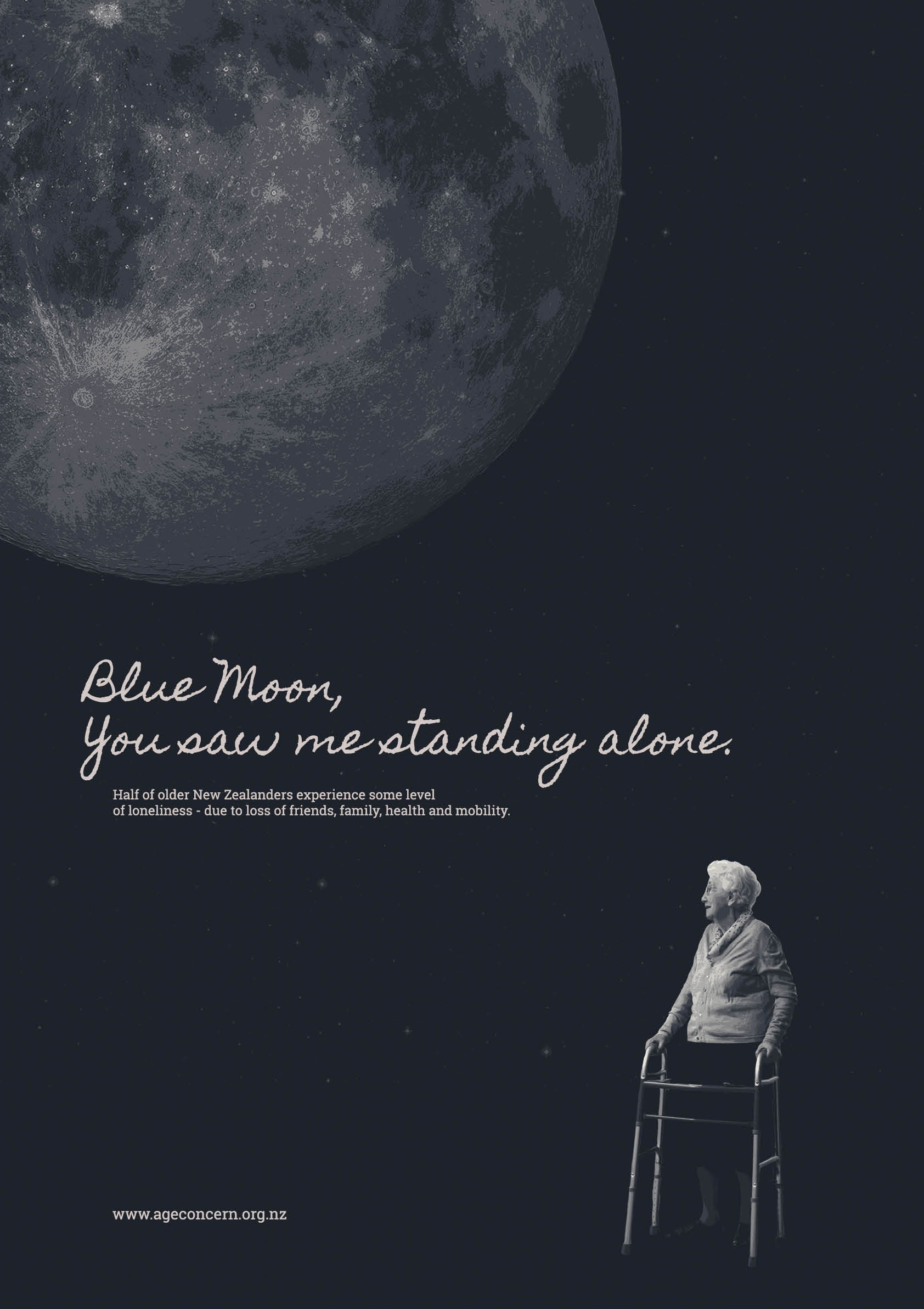
In my ‘Blue Moon’ poster I explored a collage style, utilising
the rhetorical technique of pathos to elicit a sorrowful and emotional wehi. Metaphor
also plays a large part in this image, with the moon being a stand in for the
idea of overwhelming loneliness and isolation. The use of visual techniques
such as scale, hierarchy and symbolism help build the ihi of this work – it creates
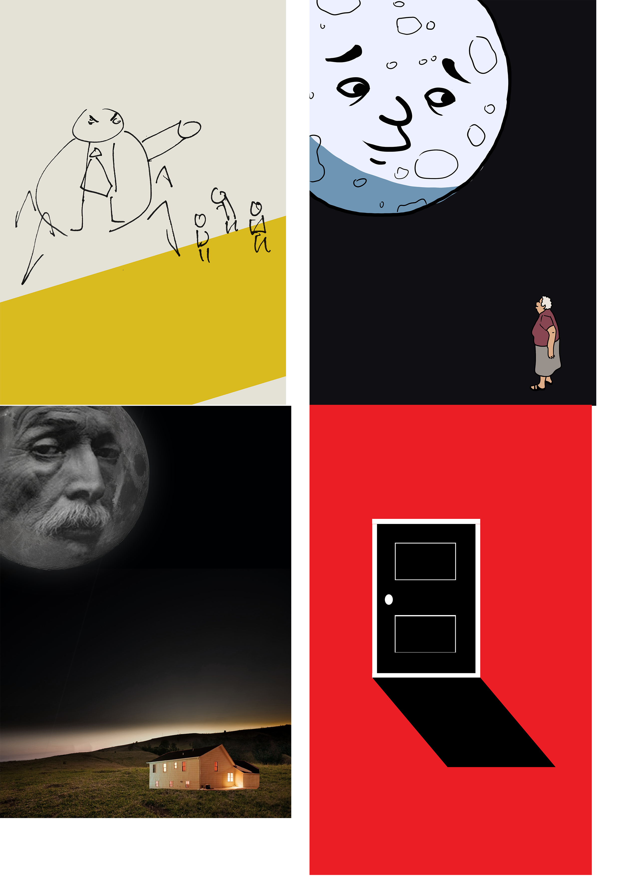
sombre image, the moon dwarfing the old woman against a cold sky.
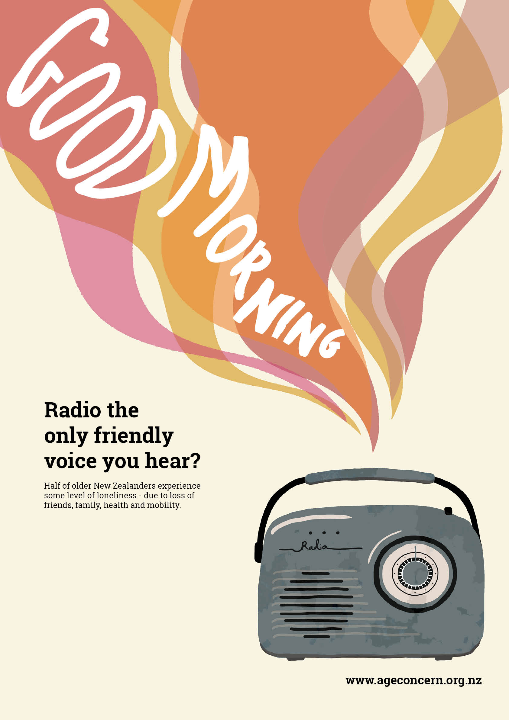
In my radio poster I tried an illustrative approach, again
using pathos to elicit a sympathetic wehi. However, I employed different visual
techniques in this poster to achieve this – the use of bright colour initially fools
the viewer into believing the poster is light hearted, but the true theme soon
becomes apparent upon closer inspection – the contrast between the bright, warm
toned music and the old, cool toned, desaturated radio.
Below are my two finished posters – two different approaches to calling attention to the loneliness and social isolation that is prevalent amongst older New Zealanders.
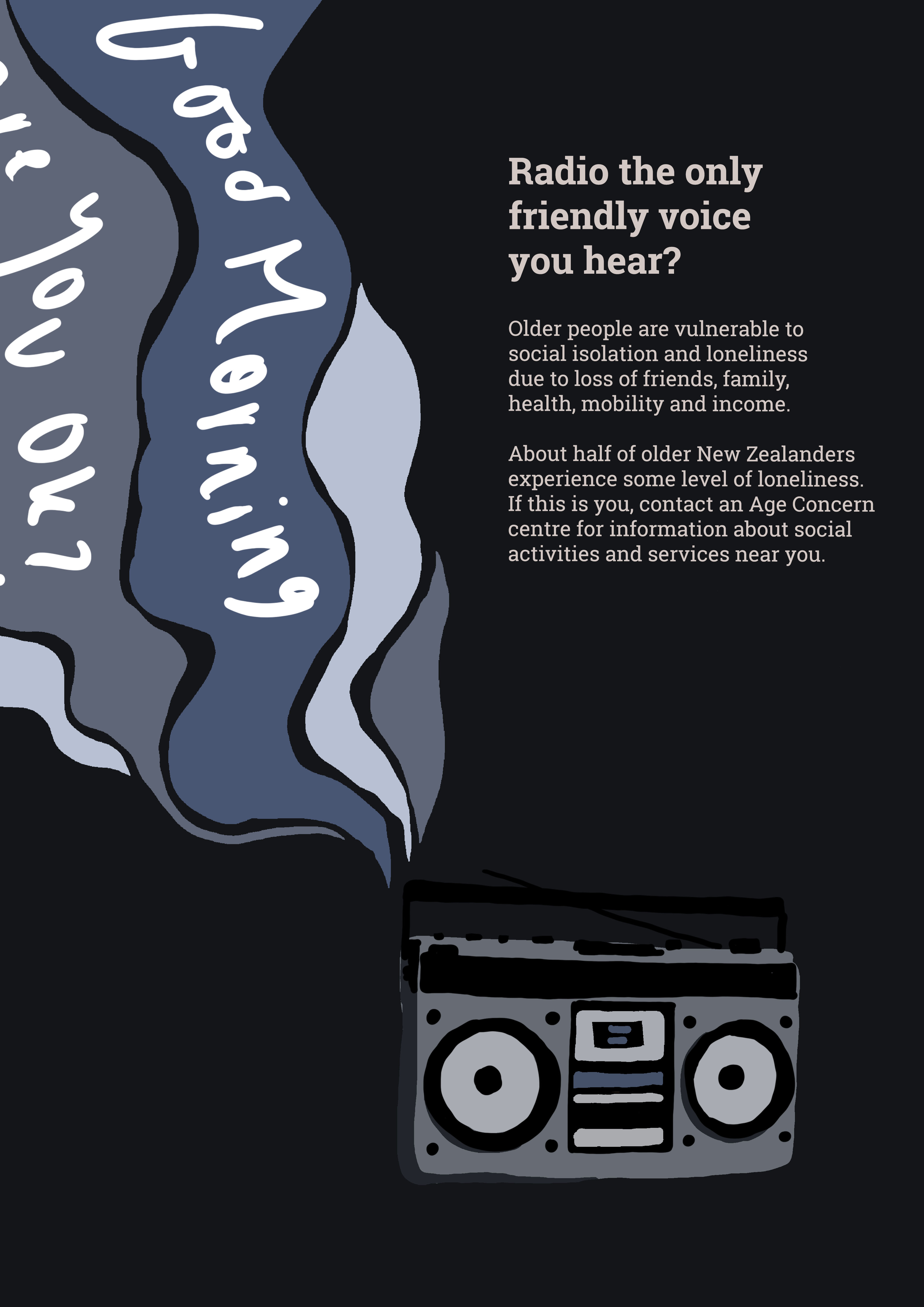
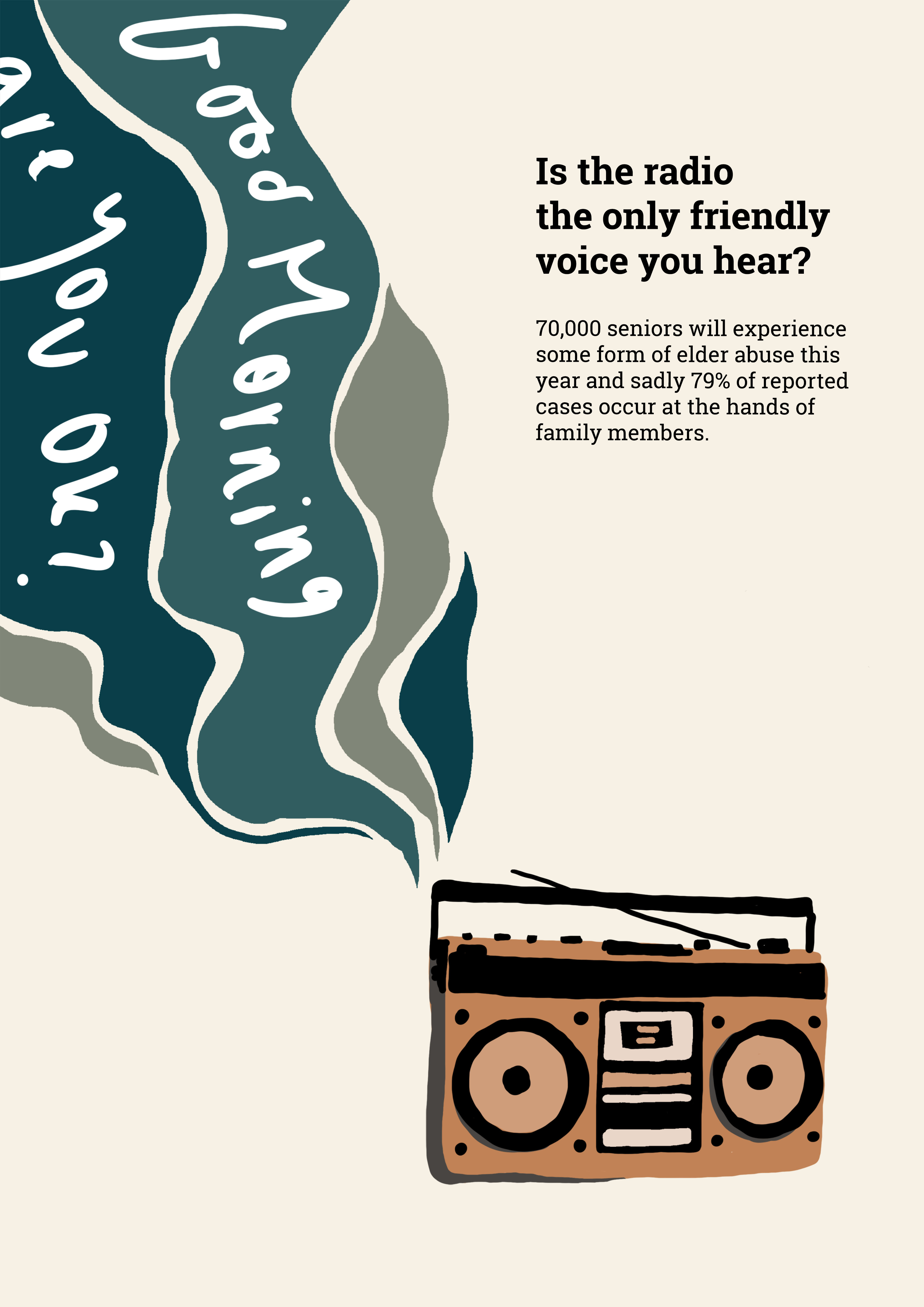
I tried a vector art / illustration approach for this poster. It is deceptive – at first glance it appears bright and cheerful, the eye is drawn to the colourful ribbons of sound in the top corner, singing a cheery ‘Good morning!’ But at closer inspection, the noise is issuing from a battered and rusted cold blue transistor radio, still sputtering out a cheery tune. I think this reflects how on the surface, people who are lonely and suffering can seem absolutely fine – cheery and happy. However when we choose to look closer, beyond the surface, we can begin to see that all isn’t well. It conveys a message to check on those in our lives that might be going day by day without a kind word from another living person – it urges us to make an effort to reach out and establish bonds with these people.
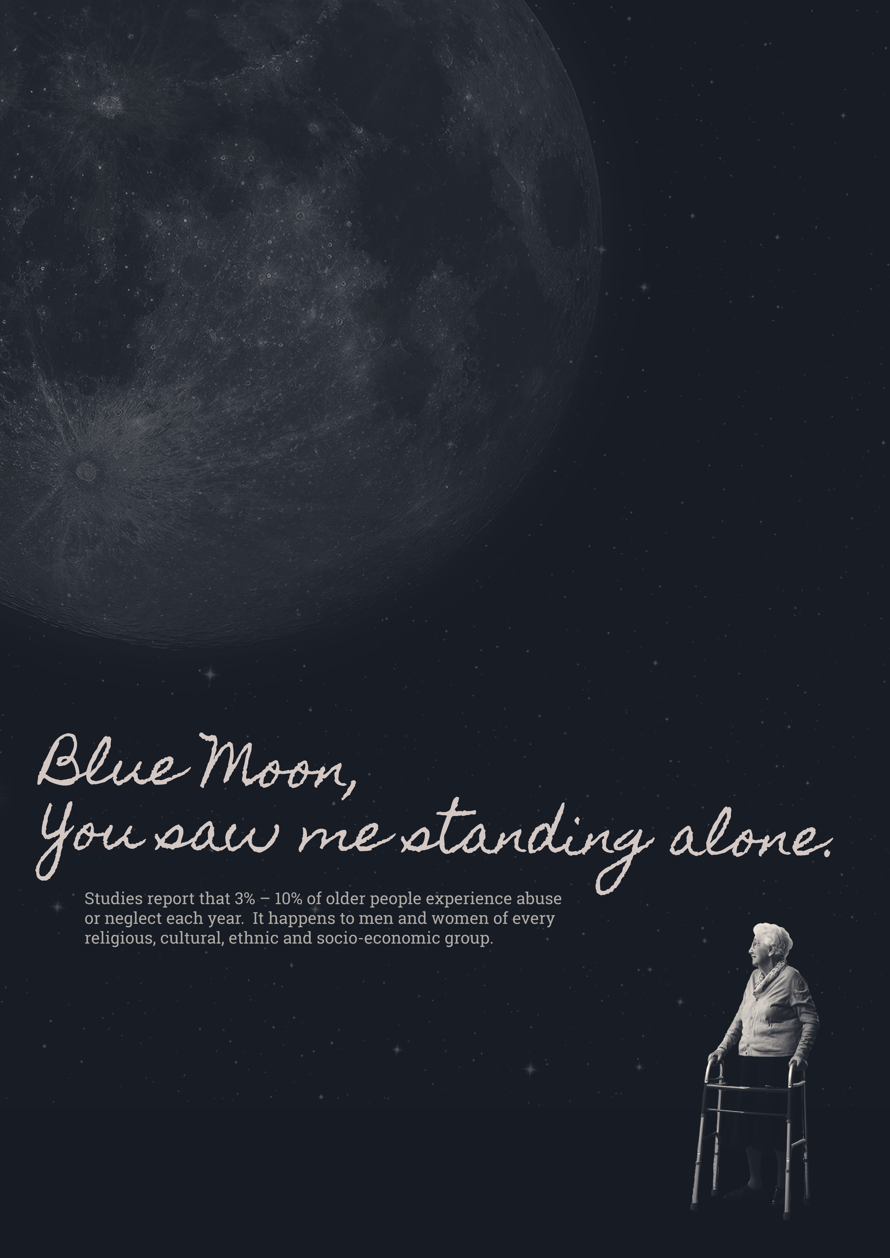
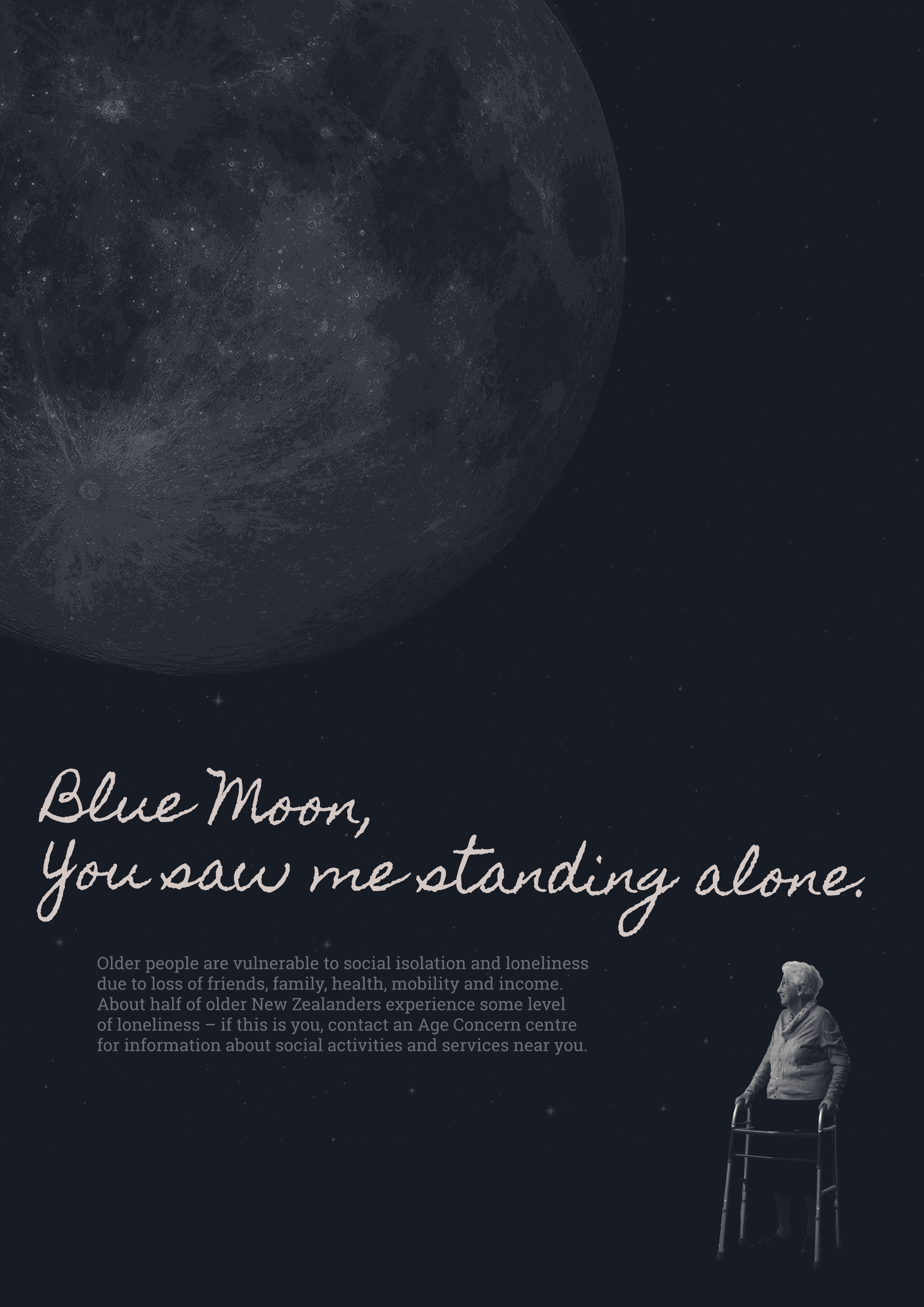
For this poster, I employed the technique of collage – editing and placing separate images together to create this artwork. With this poster, the theme is quite obvious – a hunched figure with a zimmerframe, dwarfed beneath a cold moon and a wide expanse of sky. Feelings of loneliness, pain and abandonment are obvious, and both the image and the ideas and issues it conveys are heartbreaking.
Critical self reflection:
I feel that the works I have produced are perhaps not up to the usual standard of my previous VCD assignments – however the process of creating them allowed me to brush up on some old skills, as well as learn some new ones using the programs InDesign, Photoshop and Illustrator.
I also learnt new skills in not only executing my design work, but also in analysing my work and that of others. I gained a better idea of what visual rhetoric is and how it allows me to read the meaning of an image, I understood how as a designer I can use ethos, pathos and logos as tools to persuade or convince my audience, and – perhaps most importantly – I learned about how as designers we can control the ihi of our work in an attempt to influence the wehi, or response, of our viewers.
My posters tell stories of isolation and loneliness – a small hunched figure, dwarfed beneath a cold moon, a battered and rusted transistor radio still sputtering out a cheery tune. I believe my images were quite successful in evoking an emotional response from people – I feel I am quite adept at using the persuasive technique of pathos in my work, stirring up emotions and tugging at heartstrings.
I’m proud of myself for coming up with two such original and clever poster concepts, one was born from an exercise in class, the other I envisioned whilst writing a list of words relevant to my topic. I do however think that they could certainly have been completed to a higher standard, and the work itself isn’t as strong as my original ideas. I really struggled with this assignment, I’m aware I didn’t push my moon poster far enough, and didn’t change it nearly enough – I did try other iterations, but I kept coming back to that one as it looked the best, but I’m aware it makes it look as though I haven’t done any work on it. I definitely spent more time enhancing my radio poster, and although I’m happy with how it turned out, I feel if I was just a bit more skilled at photoshop / illustrator / indesign I could have made it look a lot better and cleaner.
Below are updated version of my posters – progress pictures and edited versions can be found in my workbook, I’m just posting the current version in my blog here and writing what I like / intend to change.
RADIO POSTER:
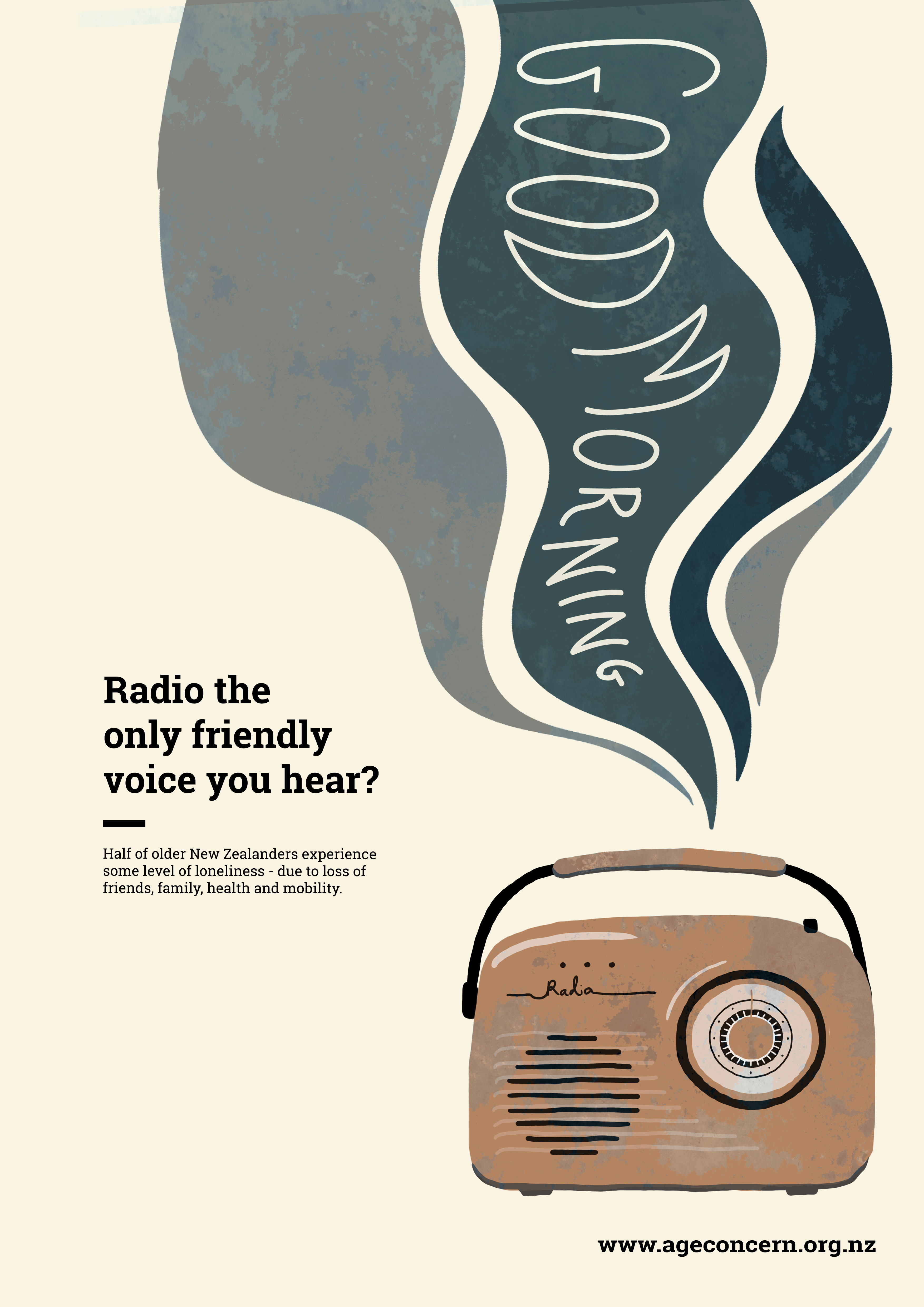
After playing around with the positioning of the radio, music and text, I discovered that this layout works the best, with the text in the middle on the left hand side, instead of in the upper right corner.
I tried out a small rule out of interest, but I think it looks a bit awkward and I will omit it in the next version.
I really like the old, splotchy, rusty look of the transistor radio in this iteration – it gives the flat vector image some more character and dimension, and the weathered appearance makes it look old, worn and broken – mirroring how some elderly people who are experiencing social isolation and loneliness as a result of health and mobility issues might possibly feel. I don’t think the pattern works on the music waves however, so I will omit it next iteration.
I was given the feedback that my title describes the radio as ‘the only friendly voice you hear’ – implying that it is a happy thing, a soothing voice, a bright spot in someones day. However the radio waves in my image are dark, sad, muted colours – this doesn’t really make sense with the text. So I will be swapping the colours of the radio and radio waves around, making the radio old and rusty and the music / waves bright and vibrant and patterned.
OLD LADY POSTER:
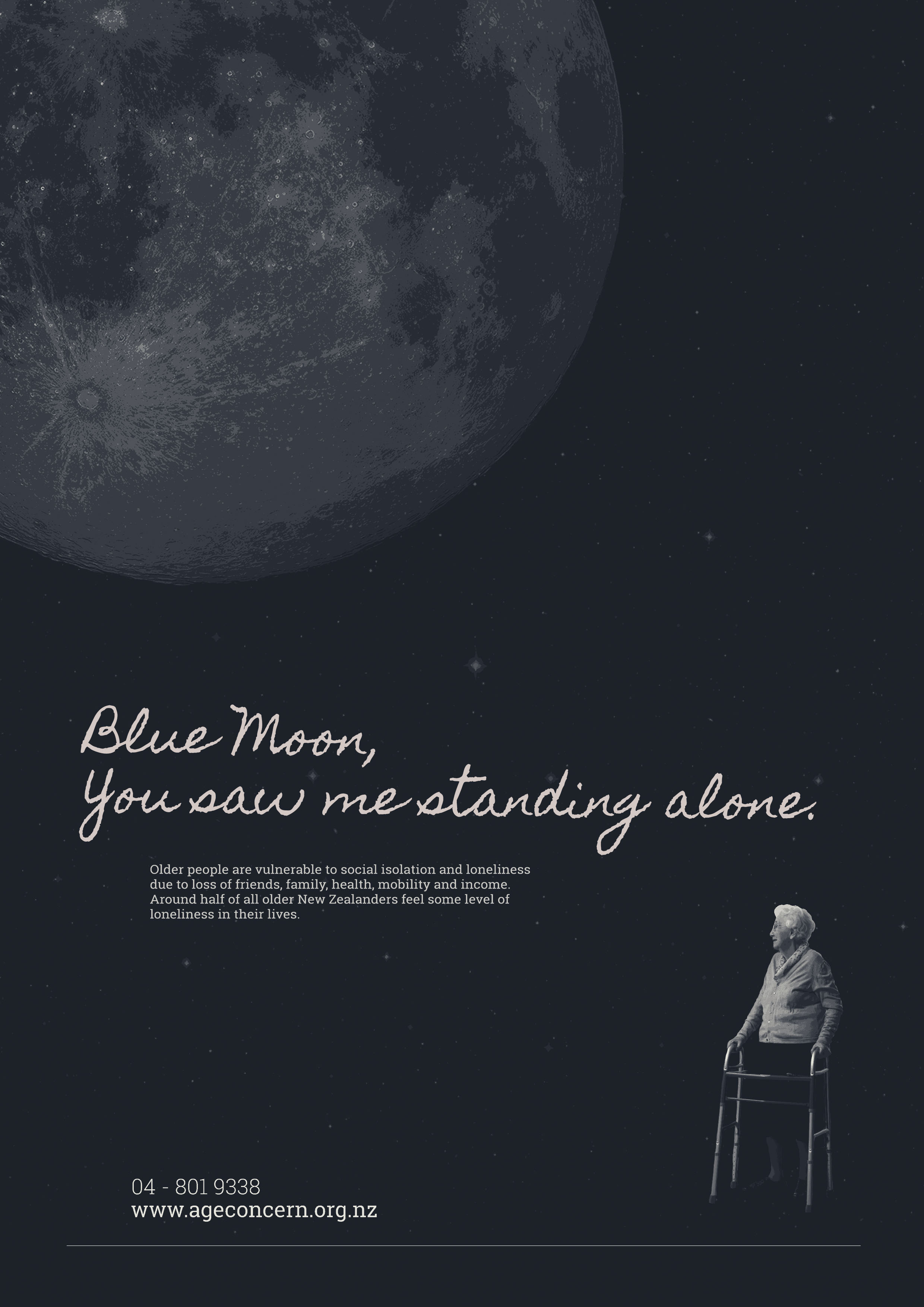
I’m worried I haven’t pushed this poster far enough – I’m aware that it has stayed largely the same for the past week or so. I like the way it looks, I think the wording is clever – I don’t by any means think it is perfect, but I’m struggling with where to go from here.
There are other different versions of it in my workbook, where the woman and moon are enlarged and moved around, and the text is edited – I have tried other versions, I just seem to keep coming back to this one, which makes it look as though I haven’t done a lot of work on it even though I have been exploring other options.
The copy underneath the title looks awkward on three lines – I think I will be changing it back to two in the next iteration. I will also be removing the age concern phone number from the poster – I don’t think it is necessary, and my other poster doesn’t include it either.
Today was the second interim critique – below are the posters I submitted.
Updates:
Got rid of the words in the music shapes as I felt it looked too messy, and it feels more lonely without the words. However, I have decided it looks a little too empty without the words so I may try and write them in Illustrator so that they look neater.
Changed the illustration of the radio – I felt it was too similar to another illustration of a radio that I used as an artist model.
Added rule down the bottom.
Things to change:
Redo radio illustration in illustrator – to make it look cleaner to match the radio noise shapes
Text is still too big, particularly the age concern website address down the bottom – have it smaller and in line with the paragraph above.
Text is also too long – cut it down even more.
Try iterations with and without rule.
Updates:
I tried to cut down the paragraph text more, and make the line of the text shorter.
I added the phone number and the website address, and a rule
Made all text smaller
Things to change:
Different scales, different iterations with text moved around
Try many different iterations, rearranging things – as not much has changed from my original posters from a few weeks ago, and I feel like I need to push them further.
For this class we had to present our two slightly improved posters printed full size.
Poster 1 Interim Version:
Poster 1 New Version:
My changes from the interim version:
I added a posterised effect in photoshop, which I like – it is quite subtle.
I tailored the copy to be more relevant to my topic of mental health issues caused by loneliness and social isolation in the elderly, as opposed to physical abuse.
I also brightened the poster, in an attempt to make it print out in more detail.
Things to change for future iterations:
Now it is blown up I can see that line length of text is too long, all text is too big and there is too much of it – condense
Try different text layouts e.g. Blue Moon text on different lines
Text in newer version is greyer for some reason – it looked better brighter white like in the interim version
Add age concern contact number down below, to make text less bulky – try adding age concern logo too?
Moon doesn’t look out of place against background but lady does – her edges need to be feathered / made less harsh, as she looks like she has been awkwardly stuck on to the picture.
Poster 2 Interim Version:
Poster 2 New Version:
My changes from the interim version:
Cut down title text
Tried a darker colour scheme as was suggested to me last week, to really bring home the feelings of sadness and isolation as I had done in my other poster – however I have decided it really doesn’t work as well, radio is harder to see, and overall it is just less eye catching and aesthetically pleasing than the original version.
Things to change for future iterations:
Try different colour scheme combinations
Play around with sizes and positions of the font / images
Having the ‘radio words’ (Good Morning etc.) in my own handwriting / at that brush thickness looks awful, sloppy and out of place – I need to find a way to improve this!
Text is too much / far too big
Try age concern logo / text at the bottom
Try a photographic approach if I can find access to a vintage radio. Also try having the ‘radio waves’ as ripped paper with the words written on them? Like a physical collage?
Loneliness and social isolation drive elderly into rest homes
New research from the University of Otago, Christchurch has found loneliness and social isolation can compel elderly people to enter aged care more than health issues.
Older people are particularly vulnerable to social isolation or loneliness due to loss of friends and family, health and mobility or income
About half of older New Zealanders experience some level of loneliness in our lives – approximately eight to nine percent of us feel lonely all or most of the time
Lacking social connections is as damaging to our health as smoking 15 cigarettes a day
We all have different levels of need for social contact. Some people with limited contact with friends and family may not feel lonely.
Potential causes:
living alone
relocation – moving away from a familiar environment, losing touch with people we know
loss of income as a result of reduced work capacity or retirement
losing a loved one or friends due to death or relocation
inability to participate in activities due to access issues, mobility, illness or transport.
The majority of older people are not severely lonely, but current research indicates that about half of older New Zealanders experience some level of loneliness, and 8-9% feel lonely all or most of the time. This is important, not just because loneliness is painful, but because having inadequate social relationships has been shown to be as bad for health as smoking. Loneliness has also been linked to increased likelihood of entering rest home care.
The prevalence of loneliness rises again in the 75+ age group
Who is lonely ? Factors:
Low income
Living alone
Being of an ethnic minority
Being gay or lesbian
Being over 80
Poor health and disability
Reduced mobility
Cognitive and sensory impairment
Living in deprived urban, or isolated rural area i
n the New Zealand General Social Survey, loneliness amongst older people has been strongly linked to low income (Statistics New Zealand, 2010).
“Social isolation and loneliness is an invisible condition that cannot be observed or clinically assessed because it is unique to each individual” – Dan Geraghty
New Copy Writing:
Older people are particularly vulnerable to social isolation and loneliness due to loss of friends and family, health and mobility, or income. About half of older New Zealanders experience some level of loneliness – if this is you, contact your local Age Concern center for information about social activities and services in your area.
Today in class was the interim presentation – we had to present 4 different concepts, and make a decision as to which one we would choose to continue with.
Four Concepts:
Ticks: 13
Ticks: 7
Ticks: 5
Written feedback: There’s such a loneliness I get from this one, great job evoking wehi.
Ticks: 0
My Feedback session:
What is the central issue? Elderly Abuse
Is the central issue easy to identify? Yes
If so, why? Dark, sad colours evoking feelings of isolation, loneliness and pain. Objects used – e.g. an old transistor radio, a walking aid. Objects we associate with elderly people.
What is the designer specifically commenting on about the issue? Loneliness, isolation
Is the designer using pathos (emotion), logos (logic), or ethos (authority of the presenter)
The designer is using all of them, but is mainly appealing to the emotions of the viewer – using pathos to make people aware of the plight of elderly people.
My chosen concept moving forward:
The positive feedback I recieved has made me aware that I have created some designs that are working in the way I wanted them to, and are evoking emotion (pathos) and wehi in the viewer.
My favourite design was the ‘Blue Moon’ poster – however it didn’t print out very clearly on paper, which is why I believe it didn’t get as many ticks of approval as my other posters did. The radio poster was probably my second favourite, as I think the colours work together very well, and are the perfect combination of aesthetic whilst also being quite washed out and unsaturated, faded and sad.
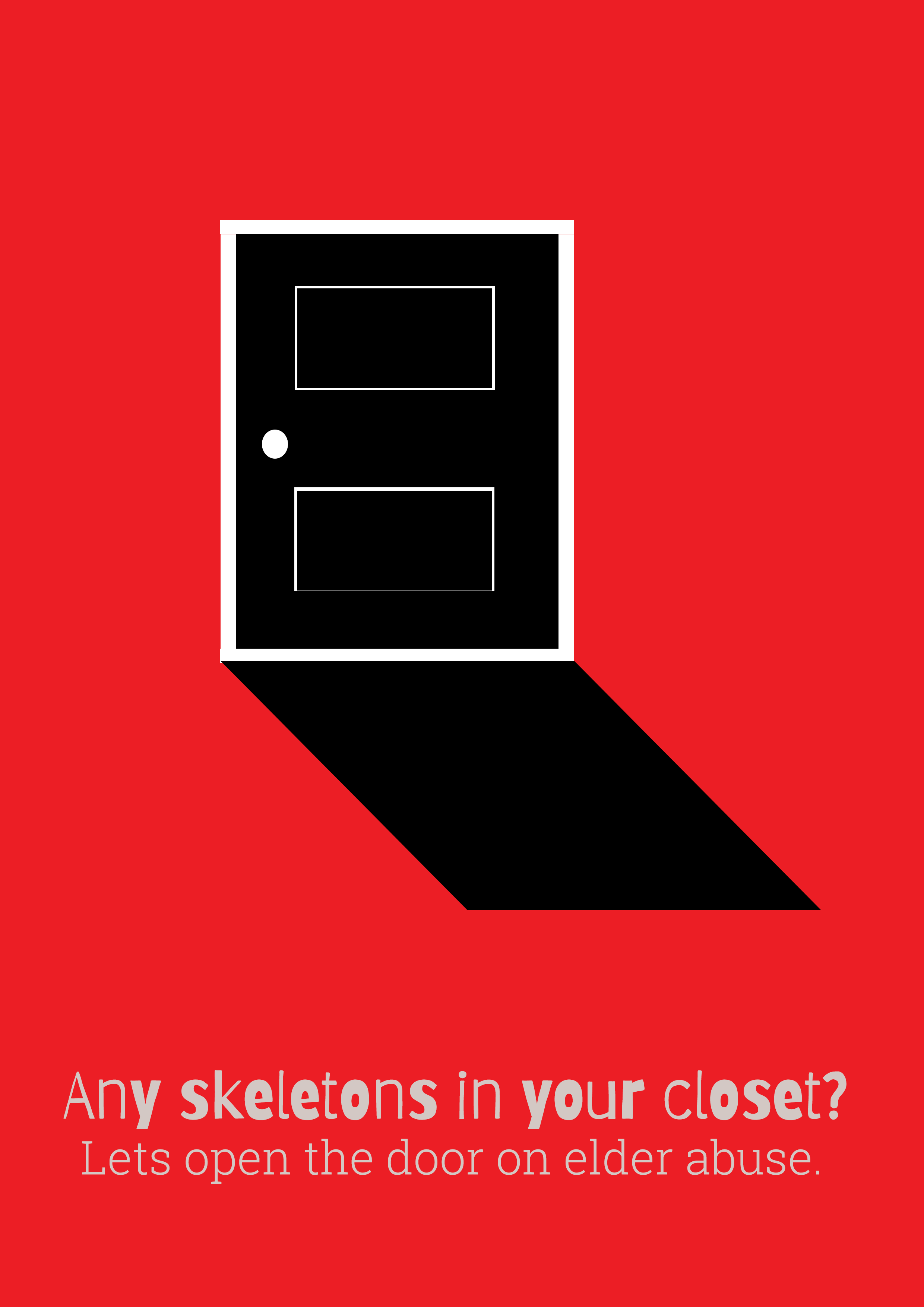
I was unsure about the colour palette of my ‘wound up’ poster – although I liked the idea and the visual of the yarn around the hands a lot, I’m not sure if the yellow background is working, and I know the informational text looks a little awkward where it has been placed. I think this poster could also work really well as a photograph. I’m aware that my final poster, the ‘open the door on elder abuse’ poster is definitely my weakest one. Although I was quite proud of the skeleton in the closet ‘open the door on elder abuse’ snappy slogan, the visual of the closet door needs something more to tie it together with my topic of elder abuse.
After some discussion, I came to realise that both my blue moon poster and my radio poster are different iterations of the same concept – loneliness, isolation and mental health issues in the elderly. Therefore, I am going to focus on improving these two posters moving forward. Although I really liked the visual of the yarn around the hands, this implied physical violence – which differs to much to the concept of my chosen two posters, as they show no reference to physical violence. I think now I have completely nailed down my topic, I can tailor my informational text a little, making it more specific to mental health and loneliness issues for the elderly as opposed to general elder abuse.
My focus: I will be focusing on neglect – not providing physical, emotional, or social needs
inadequate food, clothing, shelter
lack of social contact, support
health needs not attended to.
as well as the need to speak up about this abuse, as most elder abuse cases go undetected.
I will be aiming to raise awareness of the issues, and start discussion – I think my posters should be aimed toward older people, to encourage them to speak up about issues they are facing.
Up to 70,000 seniors will experience some form of elder abuse this year and the sad reality is that 79% of reported cases occur at the hands of family members. Most cases are not reported.
It is difficult to know exactly how common elder abuse is, as most goes unreported. An analysis of data from the New Zealand Longitudinal Study of Ageing concluded that 10% of the population aged over 65 years who are living in the community experience abuse. International studies report that 3% – 10% of older people experience abuse or neglect each year. It happens to men and women of every religious, cultural, ethnic and socio-economic group.
Supporting community and societal change that reduces ageism and promotes positive and valued roles for older people will contribute to the wider goal. Practical strategies – such as the provision of information for older people, family and carers – that support the empowerment of older people may also help to minimise the risks of elder abuse and neglect. http://www.superseniors.msd.govt.nz/documents/osc-elder-abuse-neglect-june-15.pdf
Women experienced a greater sense of vulnerability, dependence and dejection
Older people who were divorced, separated or widowed people felt considerably more sad and lonely, or were uncomfortable with someone in their family
Older Māori experienced a significantly greater level of abuse than non-Māori. Māori report being coerced more than 2.5 times the rate for nonMāori, meaning they are forced to do things they don’t want to do and people take things from them without their permission
Failure to address current levels of elder abuse is likely to have significant effects in the future. This is because the report shows statistically significant reductions in physical and mental health and wellbeing, as well as increases in loneliness and depression associated with elder abuse
Projections indicate that the number of older people experiencing elder abuse and neglect will increase significantly in the next 20 years, alongside a doubling of the 65 and over population.
Today we examined our four posters without text, to examine how effective the imagery is and what text would work well with each image.
We established that my third poster – the one of the man in the moon – is my most effective imagery, however my intended meaning doesn’t come across (an elderly person isolated from their family / society because of neglect and mental health issues) and the poster has too much of a ‘joyful’ vibe, not the sombre vibe I was attempting to capture.
I also discovered that I really need to do some more in depth research in order to narrow down my broad topic of ‘ elder abuse’, so that I can identify a select few ideas that I can work with, as at the moment there are too many possibilities and I’m not going to be able to move forward. Once I put my research all together, I’ll be able to get a better idea of what imagery would work, and what text would go with it.
For this proverb I was thinking about a poster that shows old people doing an activity as a group – perhaps zumba. The focus is on Elderly abuse, but a solution to isolation and mental health problems as opposed to a focus on the issues themselves. The slogan could be something along the lines of ‘Can’t teach an old dog new tricks? Think again!’ along with some statistics about elder mental health, and some potential activities and communities they can get involved with.
Skeleton in the closet:
For this poster idea I was thinking about how elder abuse is kept quiet, not spoken about, and can often happen in the home – hence it is a skeleton in the closet. For the poster I was envisioning a shut door casting a shadow, with an old person standing in the shadow / or perhaps a little old woman / man skeleton standing in the shadow. The text would be something along the lines of skeletons in the closet and ‘opening the door on elder abuse’.
Proverb Poster:
The poster is unfinished, I had hoped to add in a little old person standing in the shadow of the door but none of my illustrations were working – however I believe it needs this, or something else, to make it more obvious what the subject matter is, as there could be any number of things that are considered ‘skeletons in the closet’.
The image and the colours certainly command attention, however I don’t think the font works well, it is too small and thin and I feel a different one would work better. I like the impact this poster has and I would like to work on it more.