Below are updated version of my posters – progress pictures and edited versions can be found in my workbook, I’m just posting the current version in my blog here and writing what I like / intend to change.
RADIO POSTER:
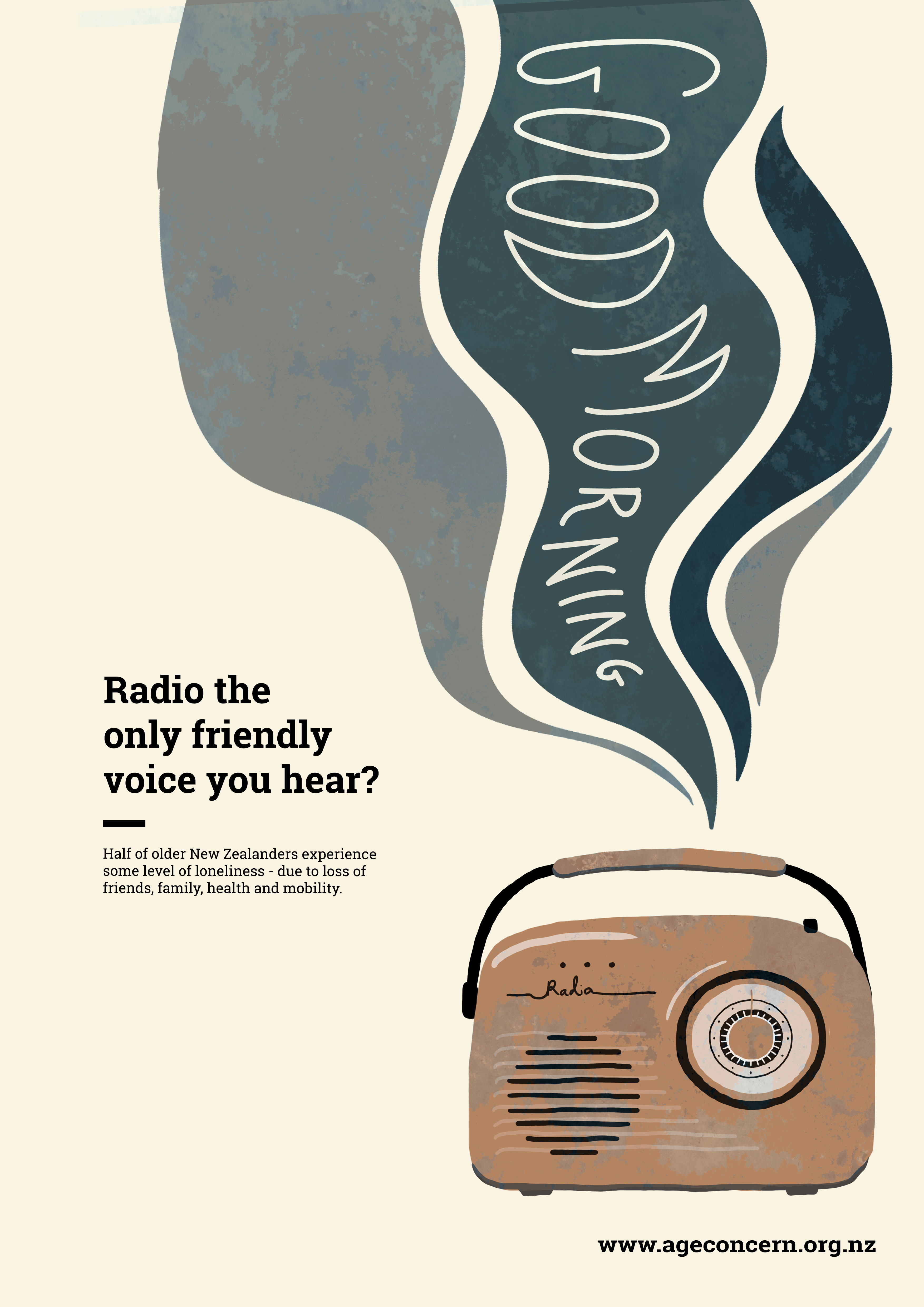
- After playing around with the positioning of the radio, music and text, I discovered that this layout works the best, with the text in the middle on the left hand side, instead of in the upper right corner.
- I tried out a small rule out of interest, but I think it looks a bit awkward and I will omit it in the next version.
- I really like the old, splotchy, rusty look of the transistor radio in this iteration – it gives the flat vector image some more character and dimension, and the weathered appearance makes it look old, worn and broken – mirroring how some elderly people who are experiencing social isolation and loneliness as a result of health and mobility issues might possibly feel. I don’t think the pattern works on the music waves however, so I will omit it next iteration.
- I was given the feedback that my title describes the radio as ‘the only friendly voice you hear’ – implying that it is a happy thing, a soothing voice, a bright spot in someones day. However the radio waves in my image are dark, sad, muted colours – this doesn’t really make sense with the text. So I will be swapping the colours of the radio and radio waves around, making the radio old and rusty and the music / waves bright and vibrant and patterned.
OLD LADY POSTER:

- I’m worried I haven’t pushed this poster far enough – I’m aware that it has stayed largely the same for the past week or so. I like the way it looks, I think the wording is clever – I don’t by any means think it is perfect, but I’m struggling with where to go from here.
- There are other different versions of it in my workbook, where the woman and moon are enlarged and moved around, and the text is edited – I have tried other versions, I just seem to keep coming back to this one, which makes it look as though I haven’t done a lot of work on it even though I have been exploring other options.
- The copy underneath the title looks awkward on three lines – I think I will be changing it back to two in the next iteration. I will also be removing the age concern phone number from the poster – I don’t think it is necessary, and my other poster doesn’t include it either.
