Below are my two finished posters – two different approaches to calling attention to the loneliness and social isolation that is prevalent amongst older New Zealanders.
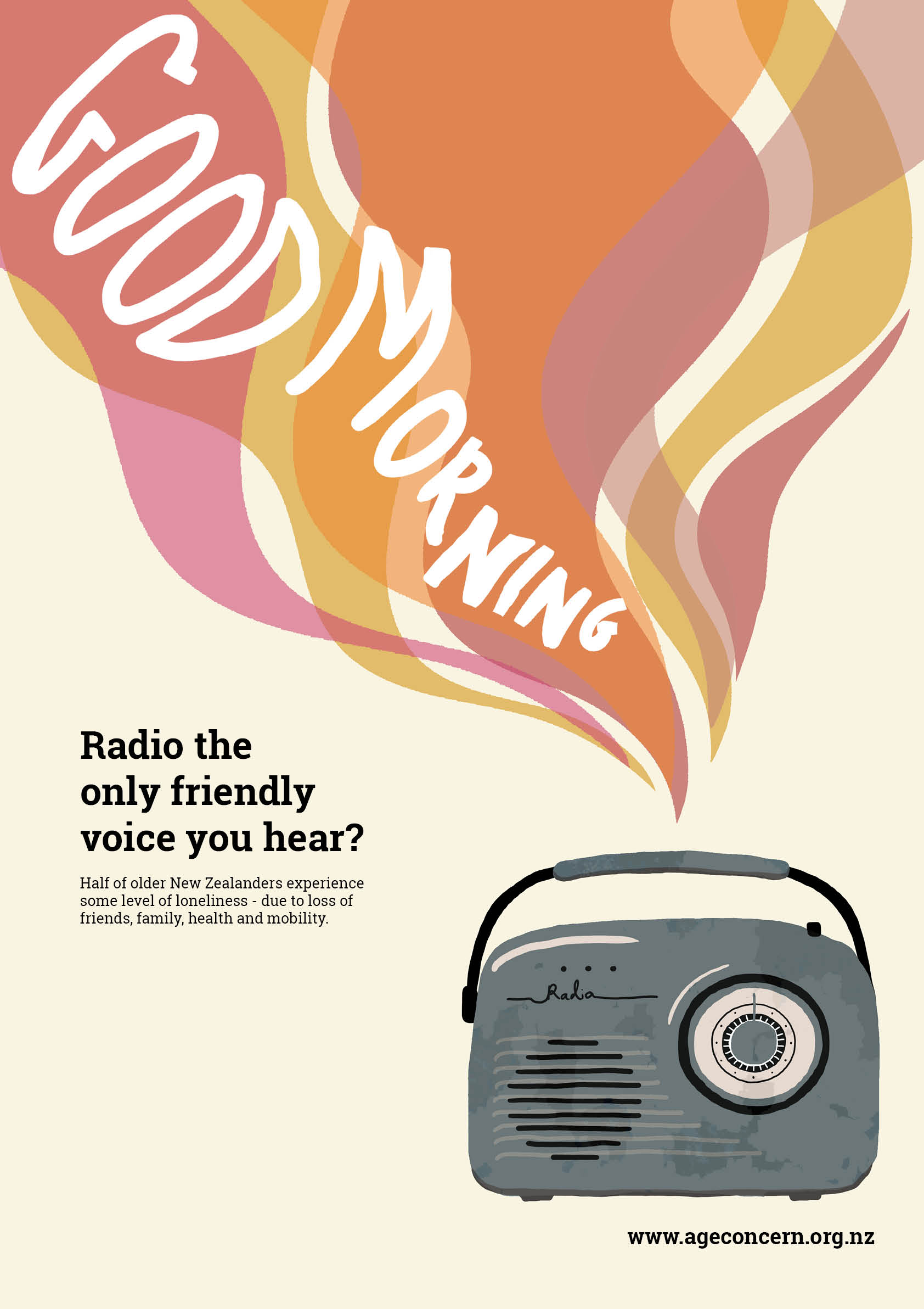
I tried a vector art / illustration approach for this poster. It is deceptive – at first glance it appears bright and cheerful, the eye is drawn to the colourful ribbons of sound in the top corner, singing a cheery ‘Good morning!’ But at closer inspection, the noise is issuing from a battered and rusted cold blue transistor radio, still sputtering out a cheery tune. I think this reflects how on the surface, people who are lonely and suffering can seem absolutely fine – cheery and happy. However when we choose to look closer, beyond the surface, we can begin to see that all isn’t well. It conveys a message to check on those in our lives that might be going day by day without a kind word from another living person – it urges us to make an effort to reach out and establish bonds with these people.
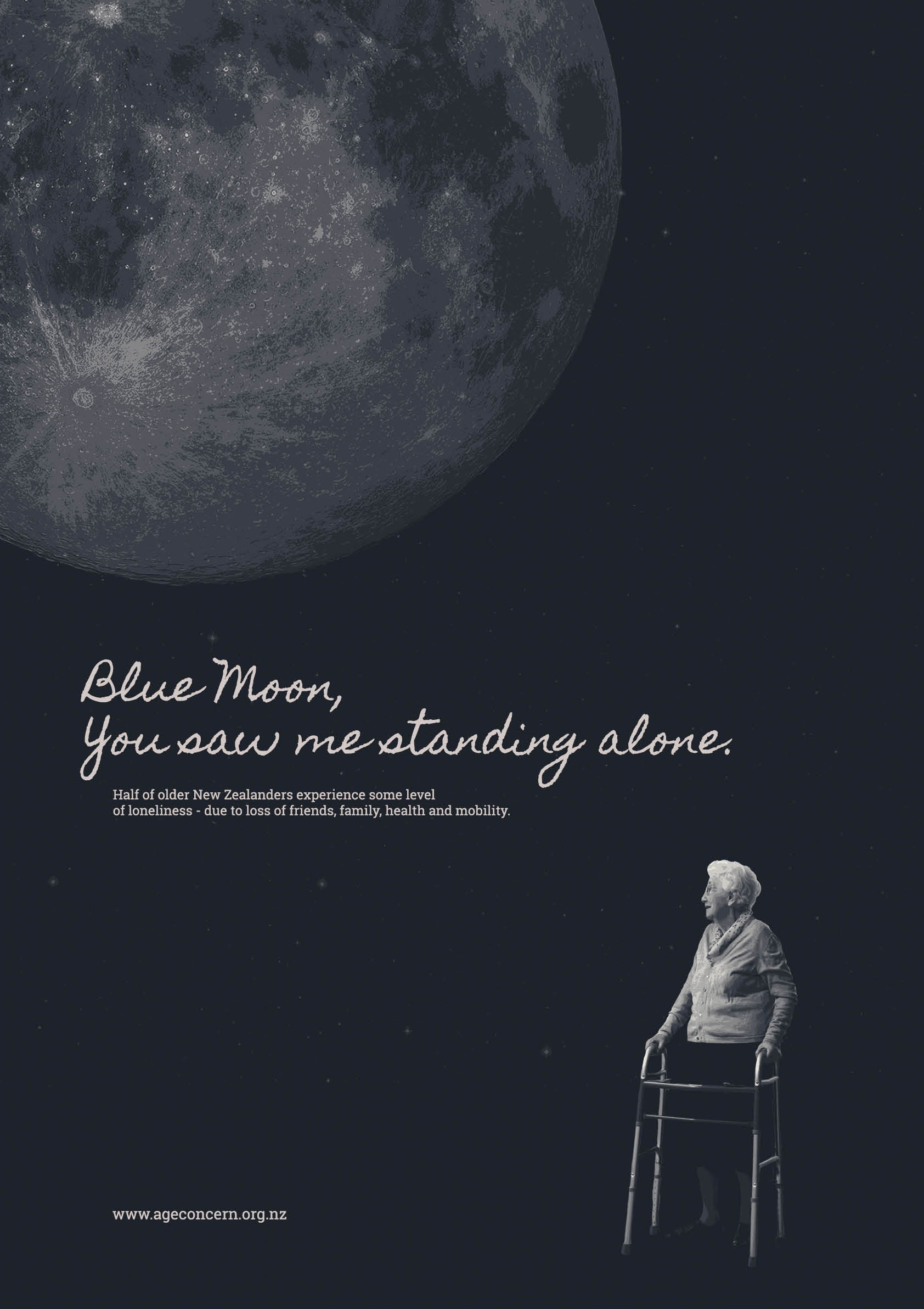
For this poster, I employed the technique of collage – editing and placing separate images together to create this artwork. With this poster, the theme is quite obvious – a hunched figure with a zimmerframe, dwarfed beneath a cold moon and a wide expanse of sky. Feelings of loneliness, pain and abandonment are obvious, and both the image and the ideas and issues it conveys are heartbreaking.
Critical self reflection:
I feel that the works I have produced are perhaps not up to the usual standard of my previous VCD assignments – however the process of creating them allowed me to brush up on some old skills, as well as learn some new ones using the programs InDesign, Photoshop and Illustrator.
I also learnt new skills in not only executing my design work, but also in analysing my work and that of others. I gained a better idea of what visual rhetoric is and how it allows me to read the meaning of an image, I understood how as a designer I can use ethos, pathos and logos as tools to persuade or convince my audience, and – perhaps most importantly – I learned about how as designers we can control the ihi of our work in an attempt to influence the wehi, or response, of our viewers.
My posters tell stories of isolation and loneliness – a small hunched figure, dwarfed beneath a cold moon, a battered and rusted transistor radio still sputtering out a cheery tune. I believe my images were quite successful in evoking an emotional response from people – I feel I am quite adept at using the persuasive technique of pathos in my work, stirring up emotions and tugging at heartstrings.
I’m proud of myself for coming up with two such original and clever poster concepts, one was born from an exercise in class, the other I envisioned whilst writing a list of words relevant to my topic. I do however think that they could certainly have been completed to a higher standard, and the work itself isn’t as strong as my original ideas. I really struggled with this assignment, I’m aware I didn’t push my moon poster far enough, and didn’t change it nearly enough – I did try other iterations, but I kept coming back to that one as it looked the best, but I’m aware it makes it look as though I haven’t done any work on it. I definitely spent more time enhancing my radio poster, and although I’m happy with how it turned out, I feel if I was just a bit more skilled at photoshop / illustrator / indesign I could have made it look a lot better and cleaner.
