For this class we had to present our two slightly improved posters printed full size.
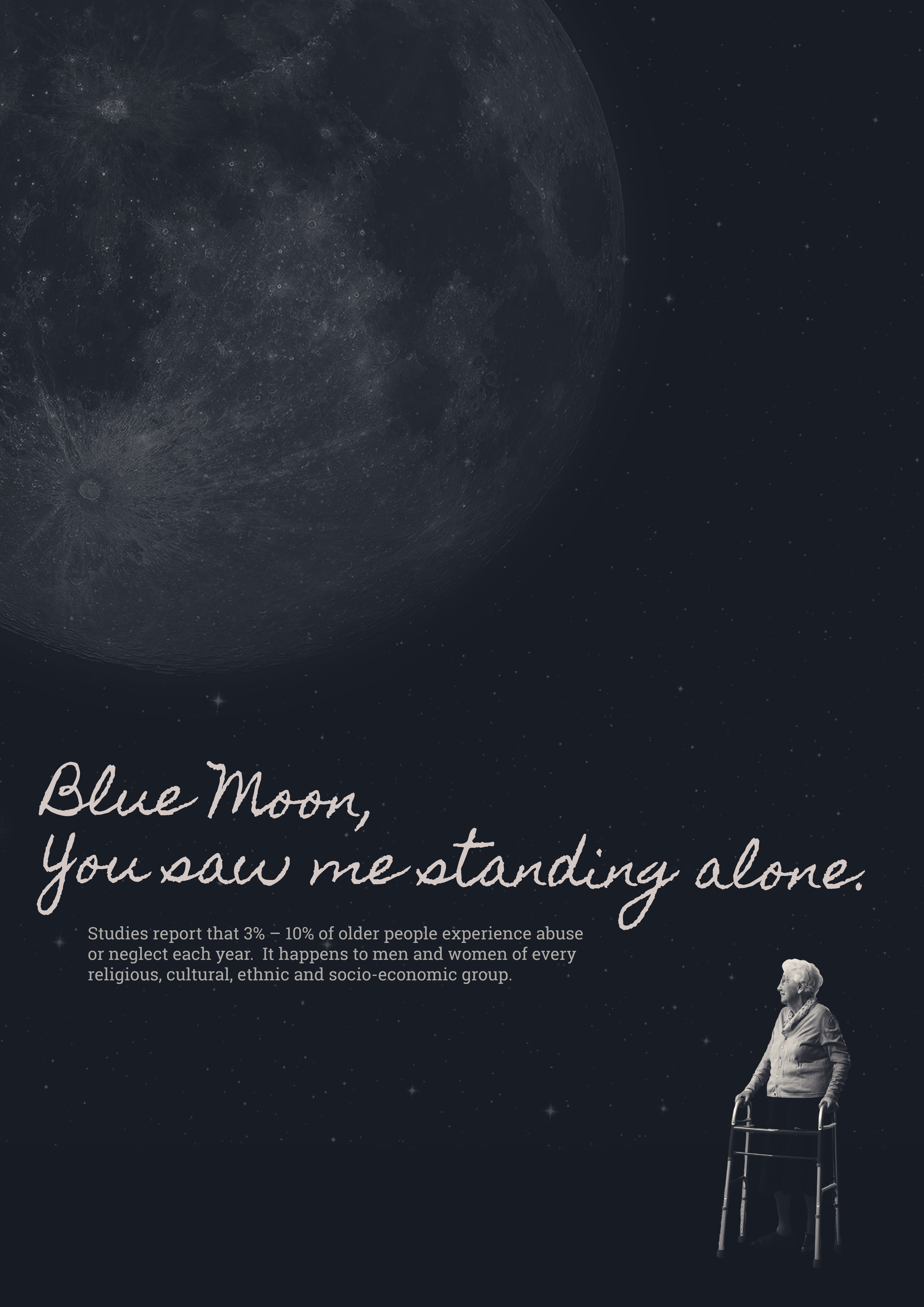
Poster 1 Interim Version:
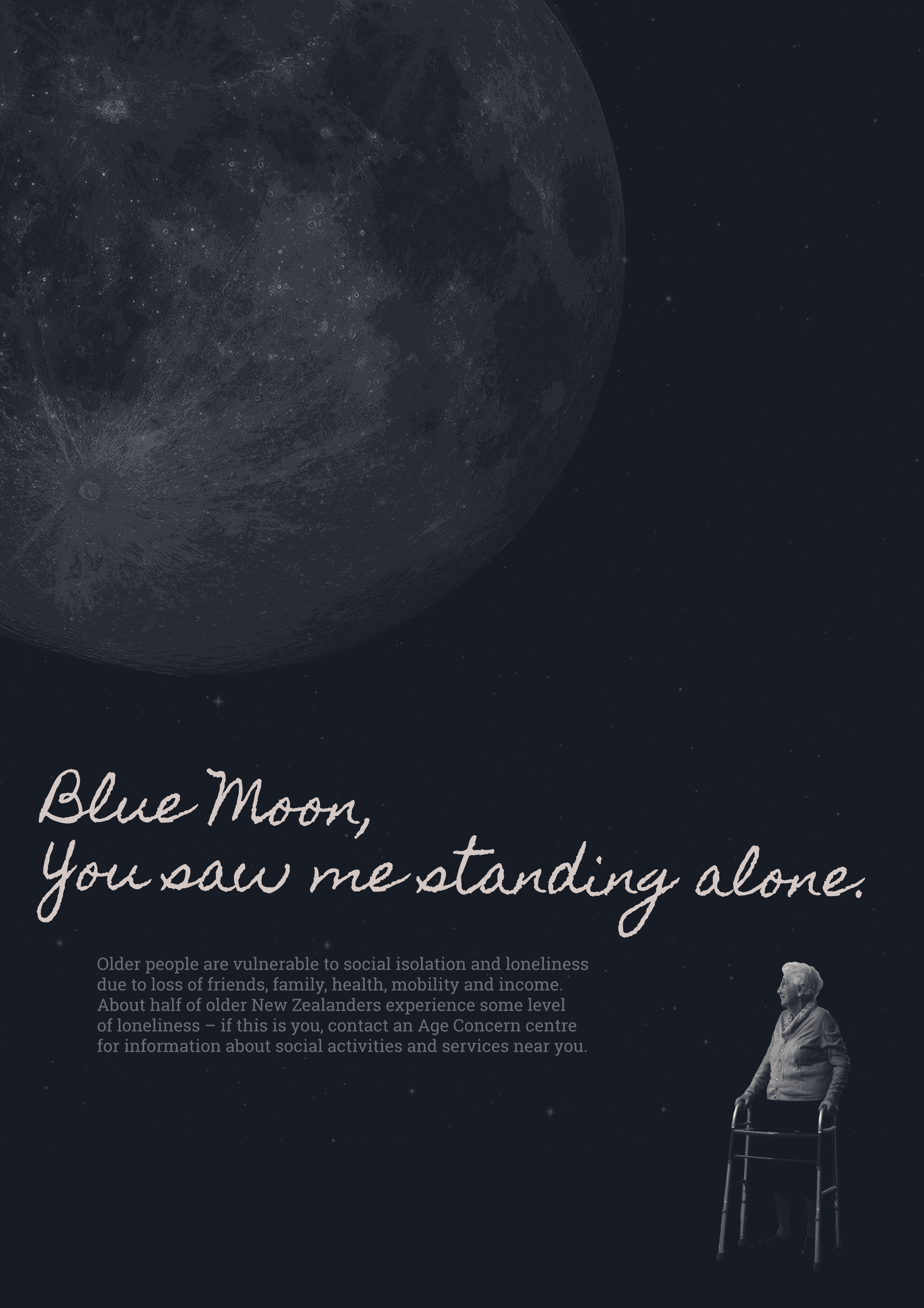
Poster 1 New Version:
My changes from the interim version:
- I added a posterised effect in photoshop, which I like – it is quite subtle.
- I tailored the copy to be more relevant to my topic of mental health issues caused by loneliness and social isolation in the elderly, as opposed to physical abuse.
- I also brightened the poster, in an attempt to make it print out in more detail.
Things to change for future iterations:
- Now it is blown up I can see that line length of text is too long, all text is too big and there is too much of it – condense
- Try different text layouts e.g. Blue Moon text on different lines
- Text in newer version is greyer for some reason – it looked better brighter white like in the interim version
- Add age concern contact number down below, to make text less bulky – try adding age concern logo too?
- Moon doesn’t look out of place against background but lady does – her edges need to be feathered / made less harsh, as she looks like she has been awkwardly stuck on to the picture.
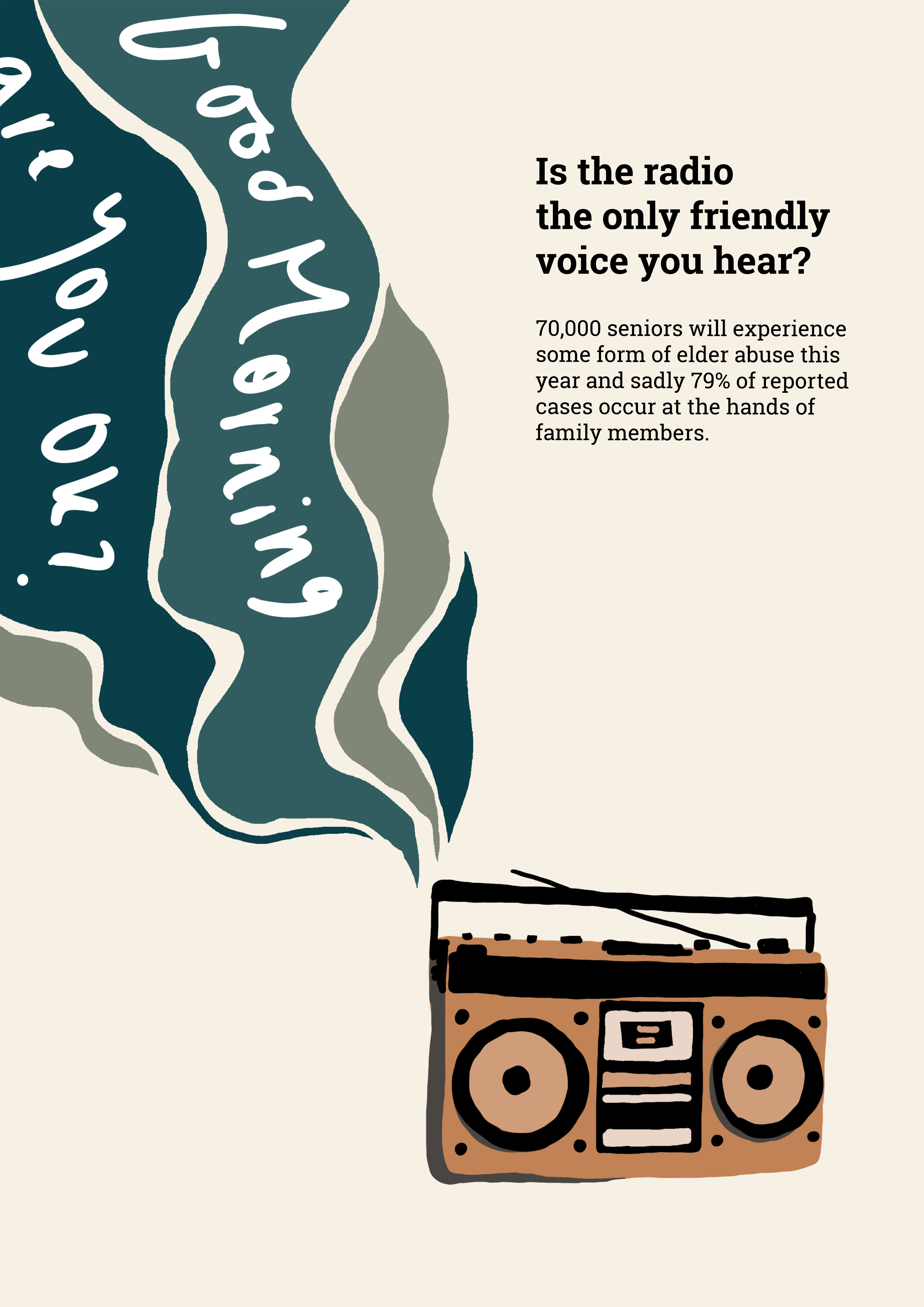
Poster 2 Interim Version:
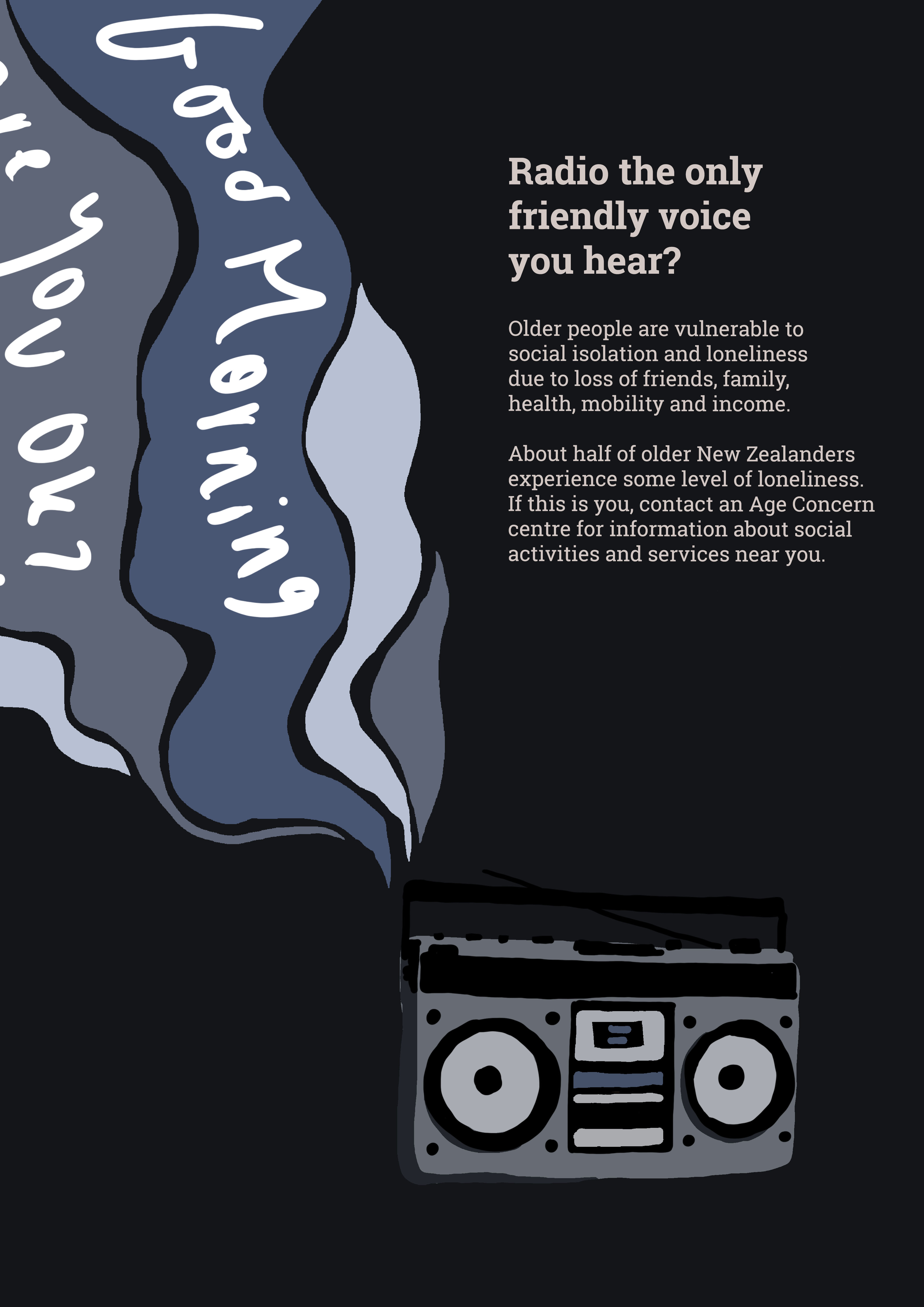
Poster 2 New Version:
My changes from the interim version:
- Cut down title text
- Tried a darker colour scheme as was suggested to me last week, to really bring home the feelings of sadness and isolation as I had done in my other poster – however I have decided it really doesn’t work as well, radio is harder to see, and overall it is just less eye catching and aesthetically pleasing than the original version.
Things to change for future iterations:
- Try different colour scheme combinations
- Play around with sizes and positions of the font / images
- Having the ‘radio words’ (Good Morning etc.) in my own handwriting / at that brush thickness looks awful, sloppy and out of place – I need to find a way to improve this!
- Text is too much / far too big
- Try age concern logo / text at the bottom
- Try a photographic approach if I can find access to a vintage radio. Also try having the ‘radio waves’ as ripped paper with the words written on them? Like a physical collage?
