Today in class was the interim presentation – we had to present 4 different concepts, and make a decision as to which one we would choose to continue with.
Four Concepts:
Ticks: 13

Ticks: 7
Ticks: 5
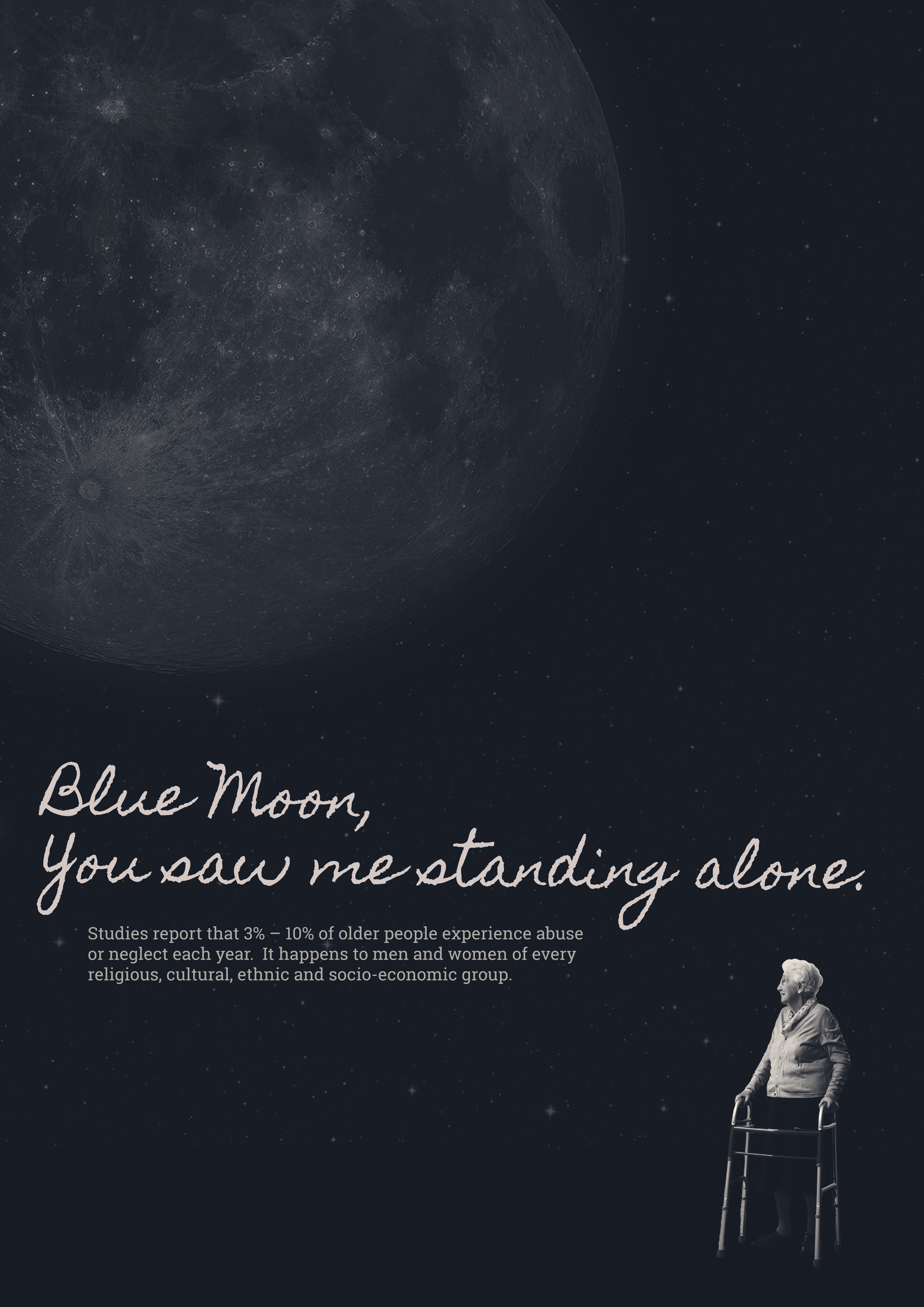
Written feedback: There’s such a loneliness I get from this one, great job evoking wehi.

Ticks: 0
My Feedback session:
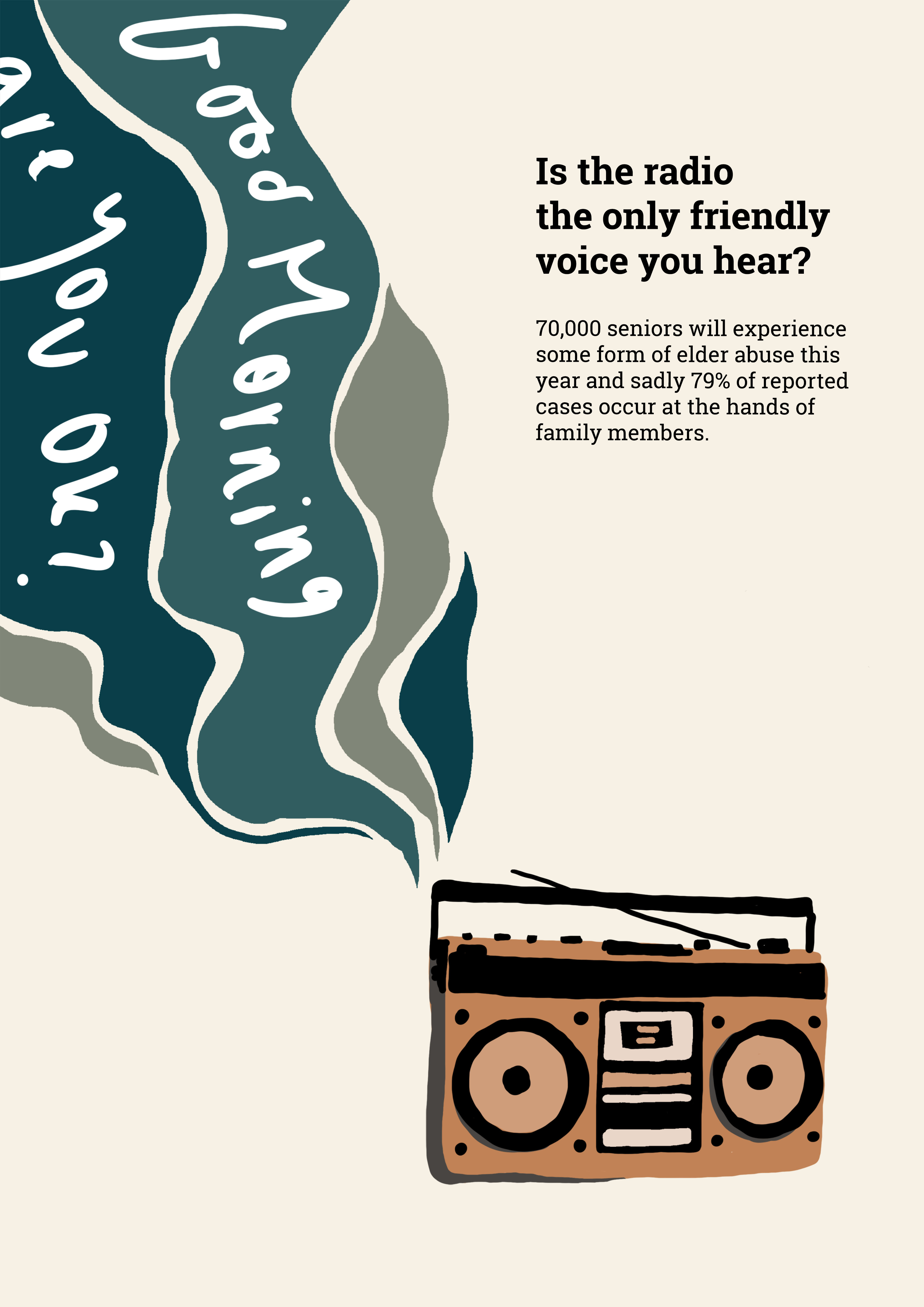
What is the central issue? Elderly Abuse
Is the central issue easy to identify? Yes
If so, why? Dark, sad colours evoking feelings of isolation, loneliness and pain. Objects used – e.g. an old transistor radio, a walking aid. Objects we associate with elderly people.
What is the designer specifically commenting on about the issue? Loneliness, isolation
Is the designer using pathos (emotion), logos (logic), or ethos (authority of the presenter)
The designer is using all of them, but is mainly appealing to the emotions of the viewer – using pathos to make people aware of the plight of elderly people.
My chosen concept moving forward:
The positive feedback I recieved has made me aware that I have created some designs that are working in the way I wanted them to, and are evoking emotion (pathos) and wehi in the viewer.
My favourite design was the ‘Blue Moon’ poster – however it didn’t print out very clearly on paper, which is why I believe it didn’t get as many ticks of approval as my other posters did. The radio poster was probably my second favourite, as I think the colours work together very well, and are the perfect combination of aesthetic whilst also being quite washed out and unsaturated, faded and sad.
I was unsure about the colour palette of my ‘wound up’ poster – although I liked the idea and the visual of the yarn around the hands a lot, I’m not sure if the yellow background is working, and I know the informational text looks a little awkward where it has been placed. I think this poster could also work really well as a photograph. I’m aware that my final poster, the ‘open the door on elder abuse’ poster is definitely my weakest one. Although I was quite proud of the skeleton in the closet ‘open the door on elder abuse’ snappy slogan, the visual of the closet door needs something more to tie it together with my topic of elder abuse.
After some discussion, I came to realise that both my blue moon poster and my radio poster are different iterations of the same concept – loneliness, isolation and mental health issues in the elderly. Therefore, I am going to focus on improving these two posters moving forward. Although I really liked the visual of the yarn around the hands, this implied physical violence – which differs to much to the concept of my chosen two posters, as they show no reference to physical violence. I think now I have completely nailed down my topic, I can tailor my informational text a little, making it more specific to mental health and loneliness issues for the elderly as opposed to general elder abuse.
