Ihi and Wehi Analysis:

Wehi – My response to this image was a humorous one, as well as one of exasperation. The ad is cheesy and funny – I appreciate the shock value of the middle finger. However the ad draws on the overused and problematic stereotype of the demanding bitchy girlfriend that is so prevalent in heterosexual culture – this bothered me.
Ihi – This work derives its power from shock value – seeing a huge middle finger on a billboard is bound to evoke a strong reaction from a lot of people. The sentiment the ad is trying to evoke is bound to strike a chord with its target audience also – this audience being ‘straight men with demanding girlfriends who are pressuring them into marriage’. The familiar and terrifying sight of an angry girlfriend staring you dead in the eyes with a disappointed face, flipping you off, is bound to get a knowing chuckle from this target audience.
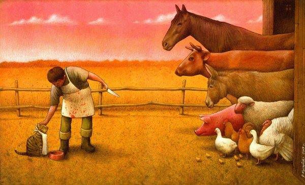
Wehi – My response to this image is one of shock, sadness, and disgust. Having recently written an essay about Western society’s disconnect from the natural world, and the way we see ourselves as having dominion over animals as opposed to co-existing equally – I found this image to be a particularly relevant and provocative commentary on the current state of our world. A world where we disgusting, depraved, cruel humans reign supreme, and see ourselves as having the right to decide the worth of another beings life.
Ihi – The power in this image lies in the subtle details. At first glance, this appears as if it could be an image from a childrens book – soft colours, sweet animals. However when one looks closer, only then can they discover how dark and twisted this ‘friendly looking’ image really is – you see the knife pointed towards the herd of farmyard animals, the caressing hand outstretched towards the pampered cat, the blood splattered apron and the ominous red sky. This images power lies in its initial deception.

Wehi – My first reponse to this image was confusion, followed by an unenthused “Oh” when I figured out what it is meant to be. A woman with sticking plasters on either side of her mouth because Burger King has ‘REAL BIG BURGERS’ and I guess they hurt her mouth as a result? Is this supposed to be an attempt at connecting to customers through humour? It certainly didn’t work with me, the image is not aesthetically pleasing and is unpleasant to look at. Why do the sticking plasters have dots? Is it because without them, the image would be even MORE hideously bland and beige and flat ?? Burger King is a cheap fast food brand – fast being the operative word. This attempt at a joke is clunky and not immediately obvious – if humour is attempted in fast food ads it should be quick, snappy, attention grabbing and obvious.
Ihi – I included this image because I wanted to try and analyse an image that I didn’t think worked well / held much power. I can see what they are trying to do / say, that they are trying to be inventive and clever, trying to be powerful in the fact that they are straying away from the typical uninspired shots of burgers and fries that are typically on fast food adverts. I just don’t think the joke is particularly clever or successful, it isn’t punchy enough to work – I can imagine this idea being pitched in some meeting or the other, but can’t imagine how it got this far. It isn’t a good image.
Inequality in New Zealand Articles:
The Spinoff:
- Article about how Muslim responses and voices were not only heard but prioritised by mainstream media for several weeks after the Christchurch mosque attacks – and then subsequently muted again as a debate over free speech took over. This debate “has overshadowed the need for medium and long term reforms that focus on whose voices are prioritised.”
NZ Herald:
- Article about underprivileged children arriving to daycare without adequate clothing and food.
